What is low - Regression Approach
This serves as an alternate compass for me to visualize what is low. See post here for another version of compass.
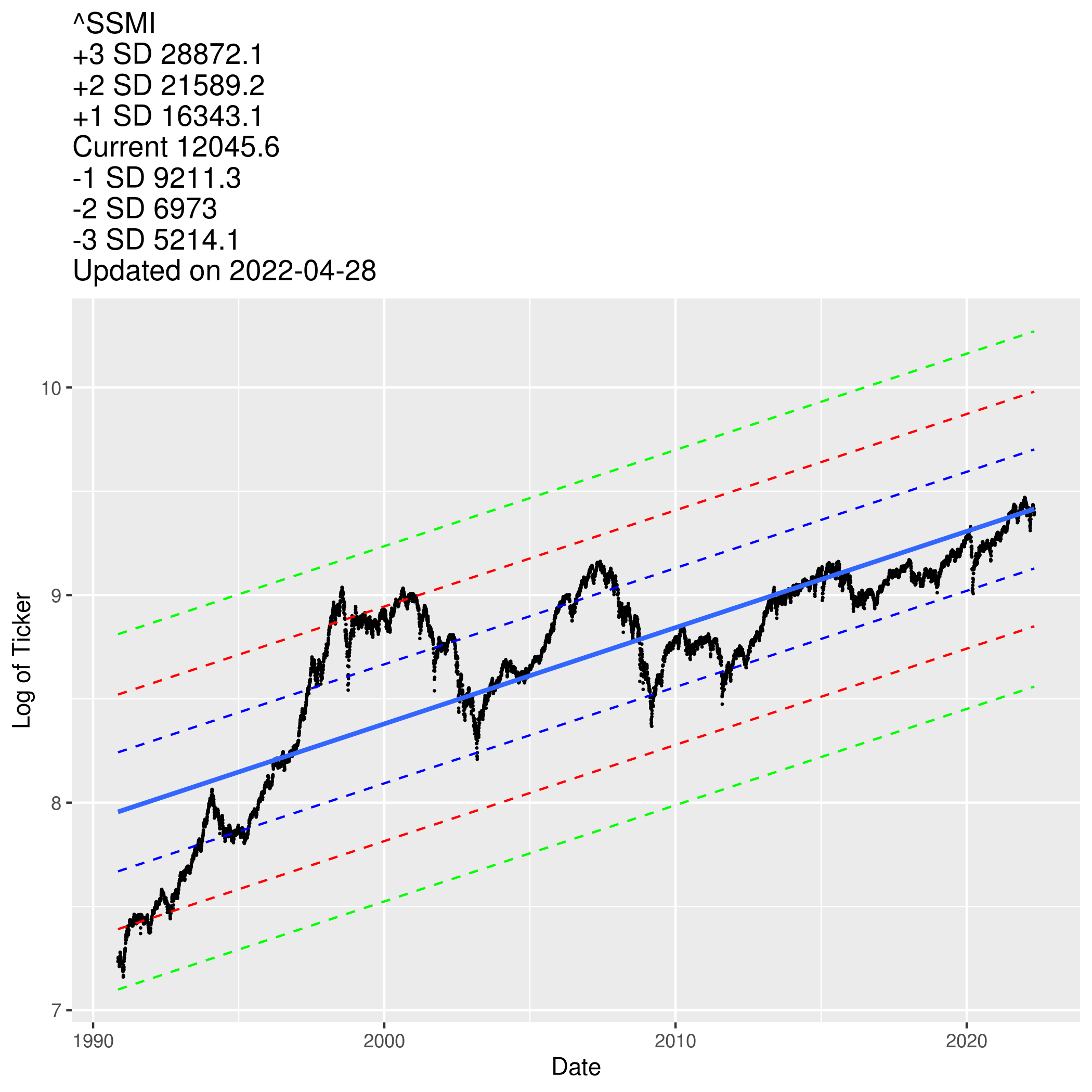
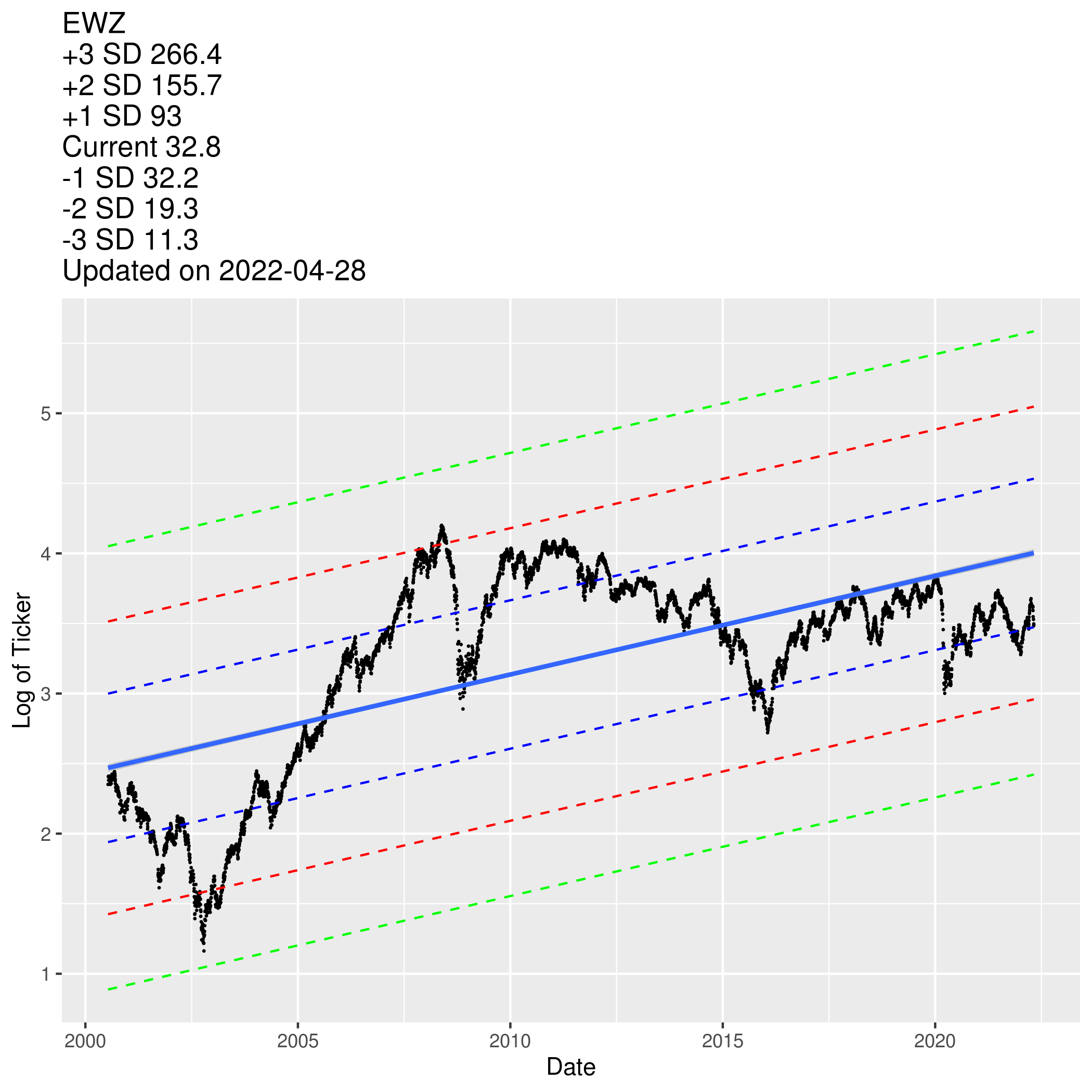
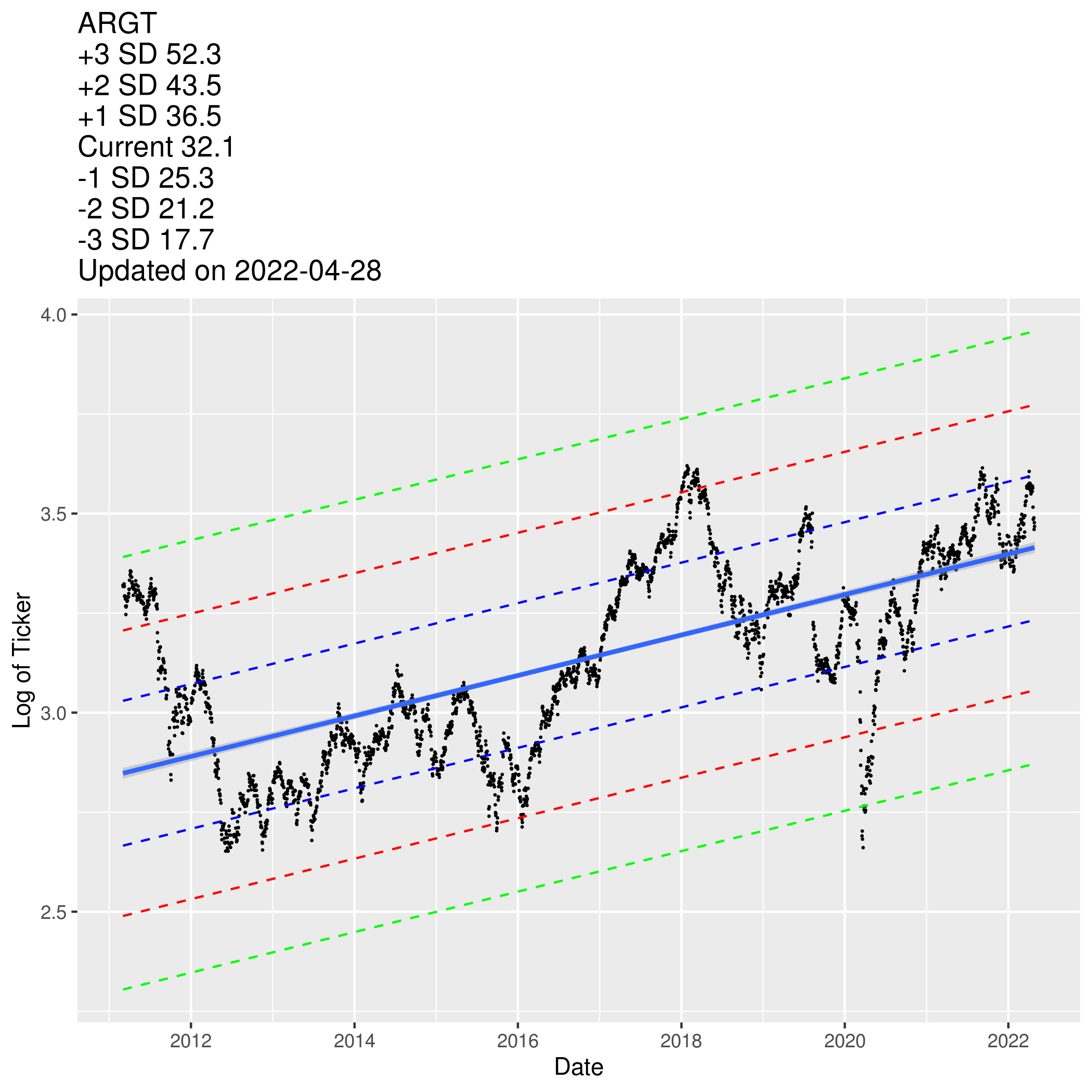
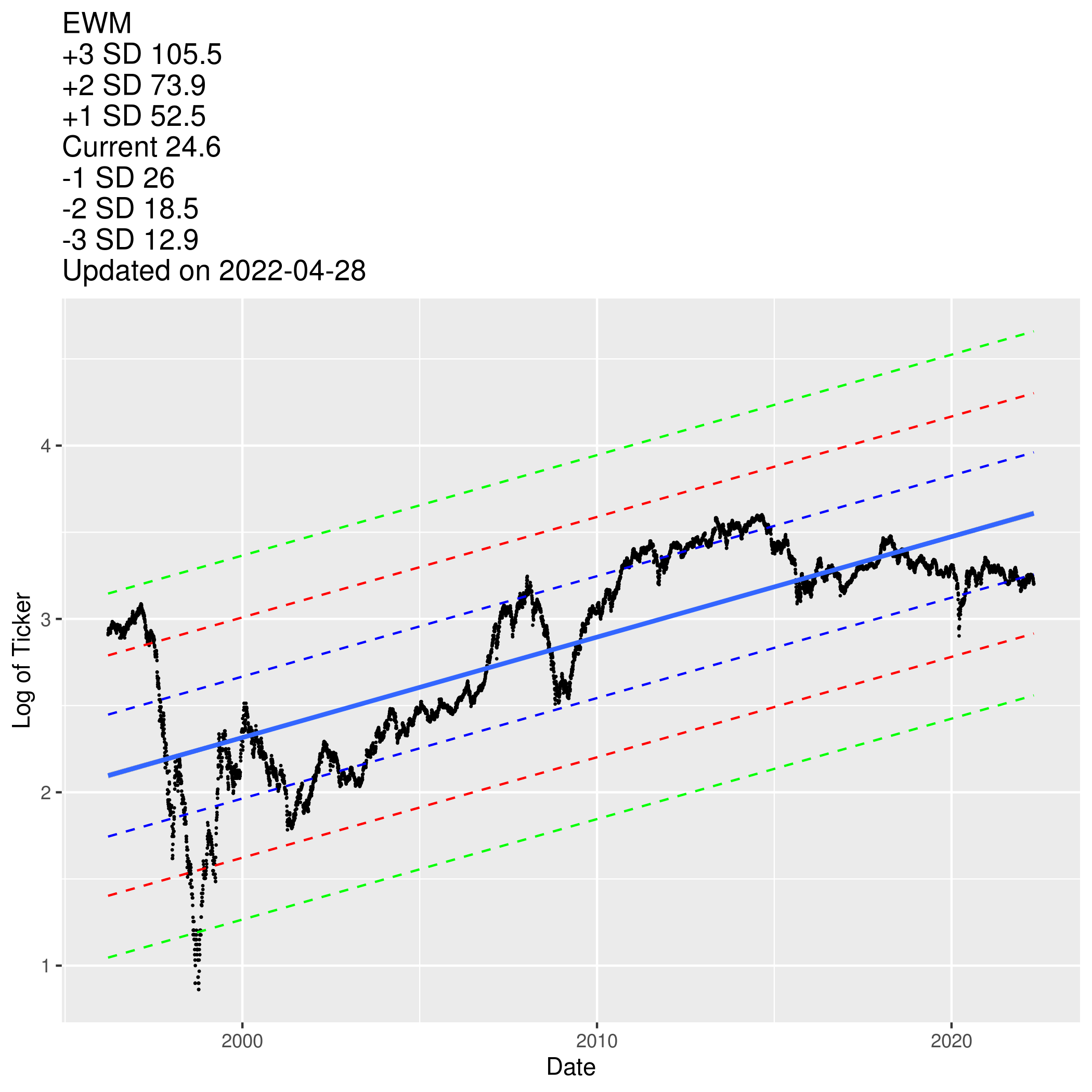
I was inspired by a post written by a local finance blogger. He used a regression line flanked by the intervals to inform whether the prices are low or not. I’m unsure what sort of intervals of intervals he used in his plots, but for my purpose I will use prediction intervals instead. You may visit this link to understand the statistical properties.
Another variation over the blogger’s method is that I used Log of Prices as my Y-axis to normalize data across time. If I use the non-log version, the prices will be too low in the beginning and it will mess up the regression line.
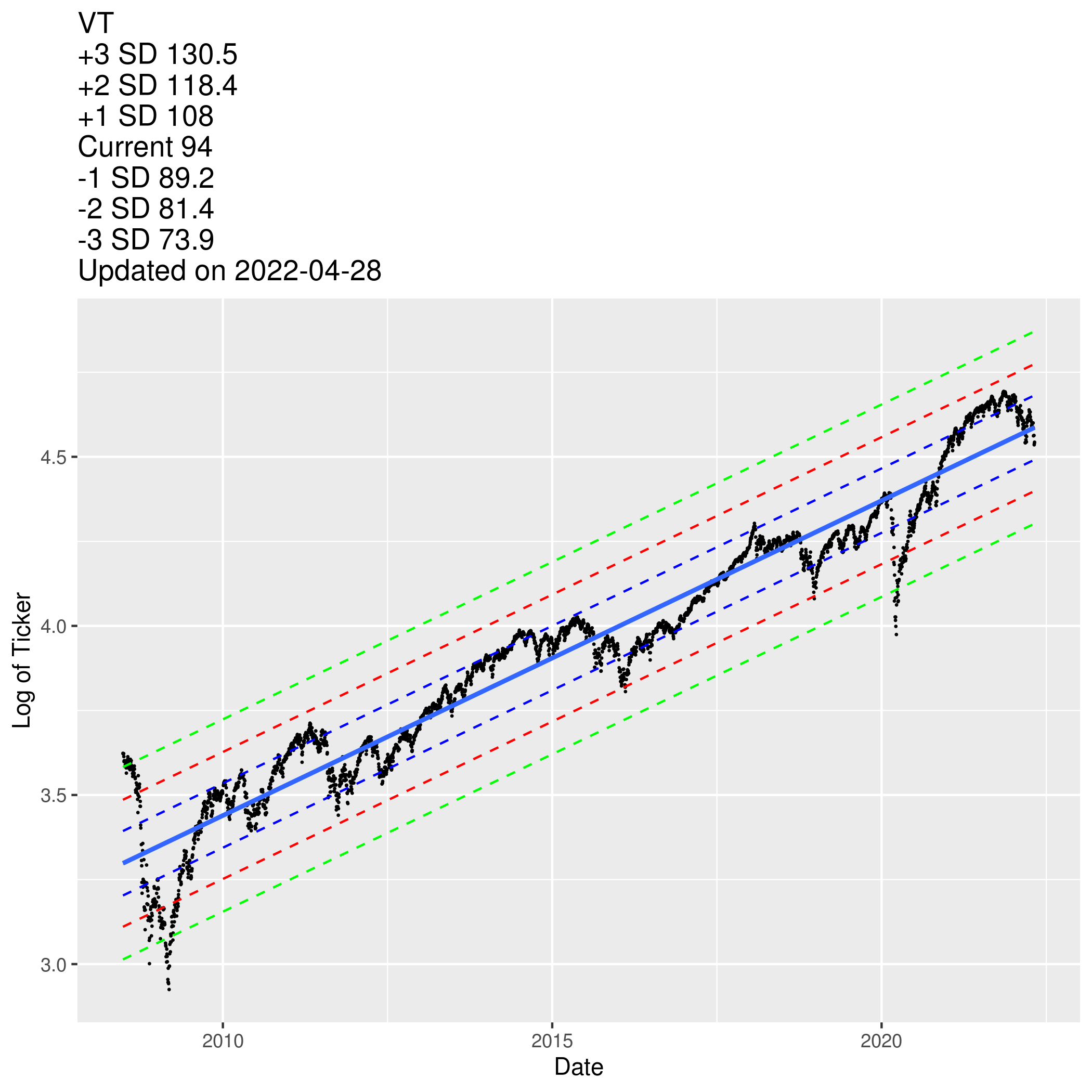
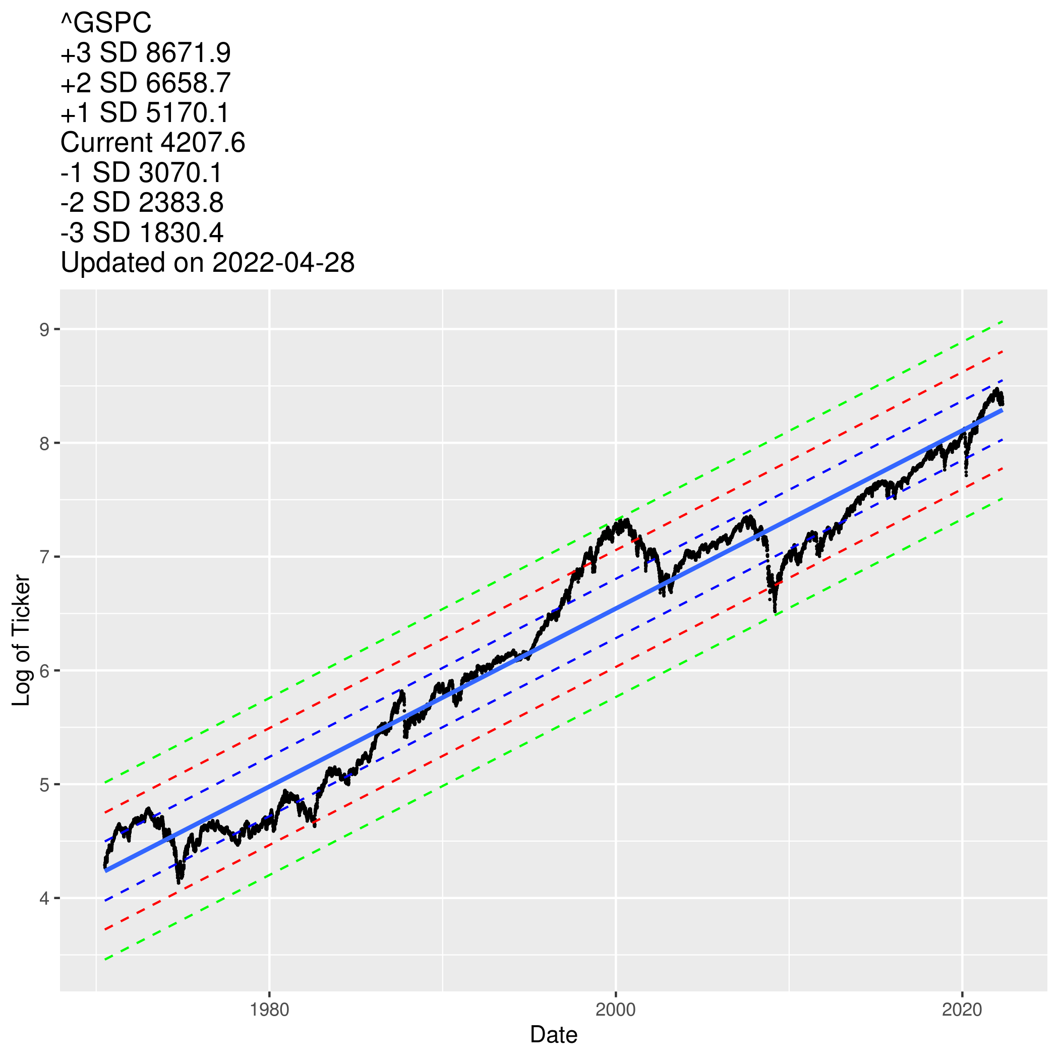
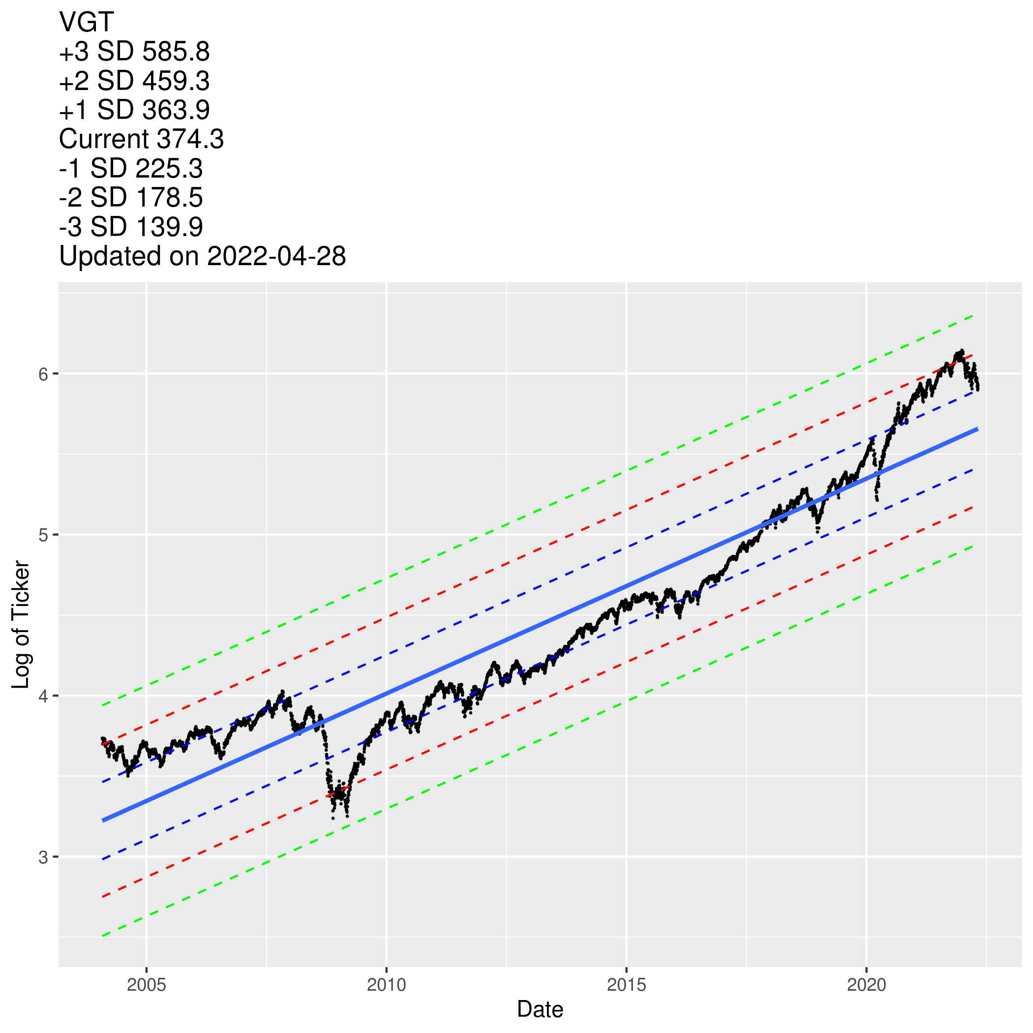
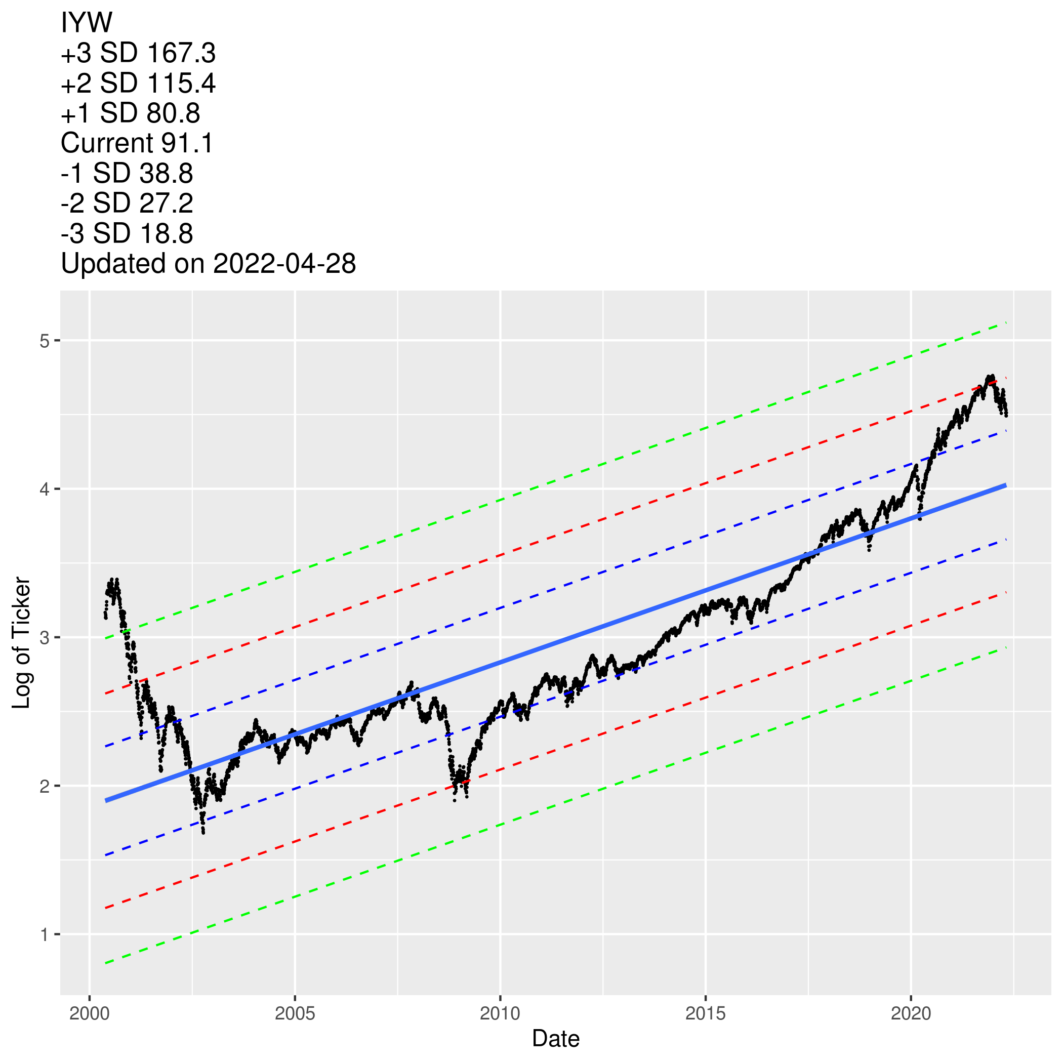
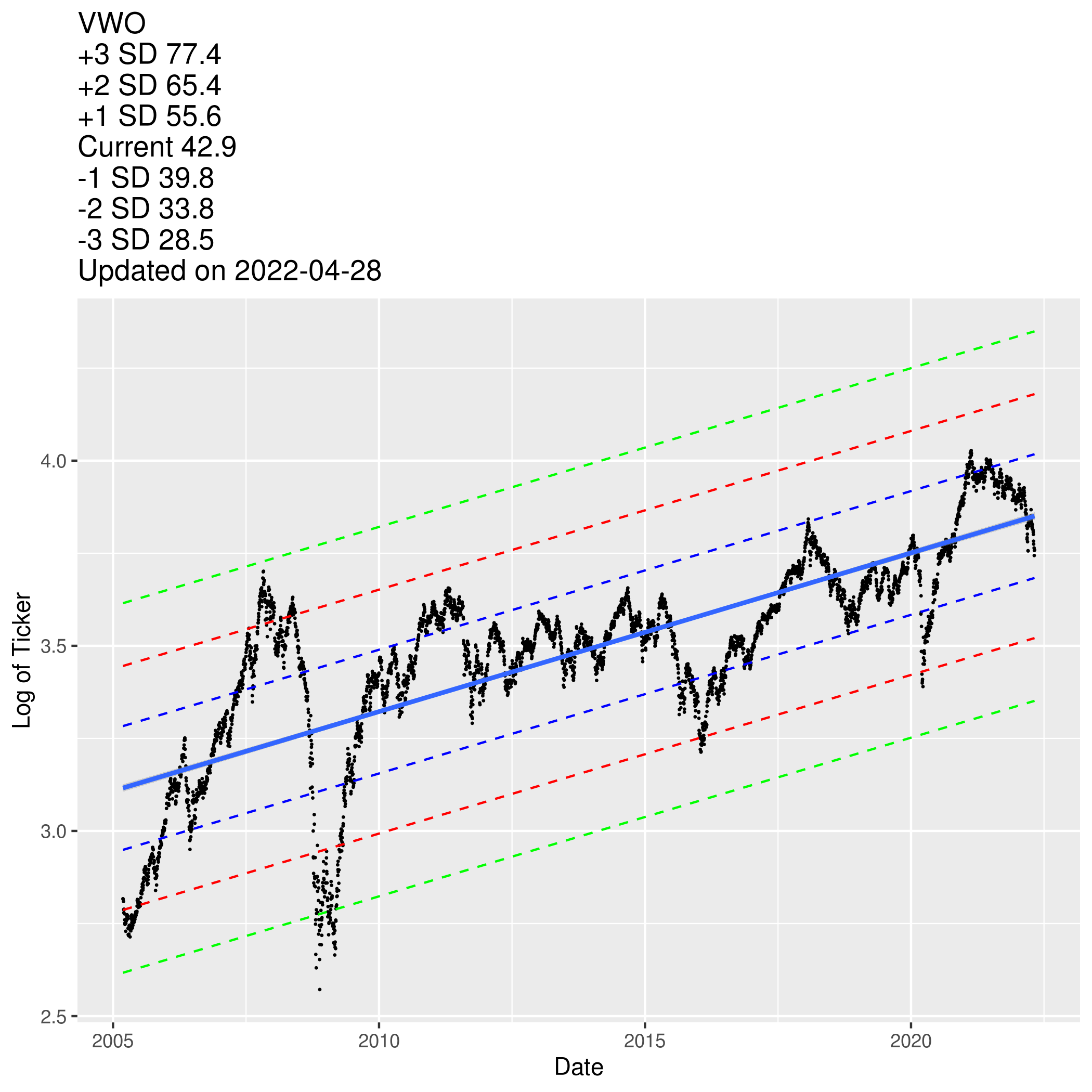
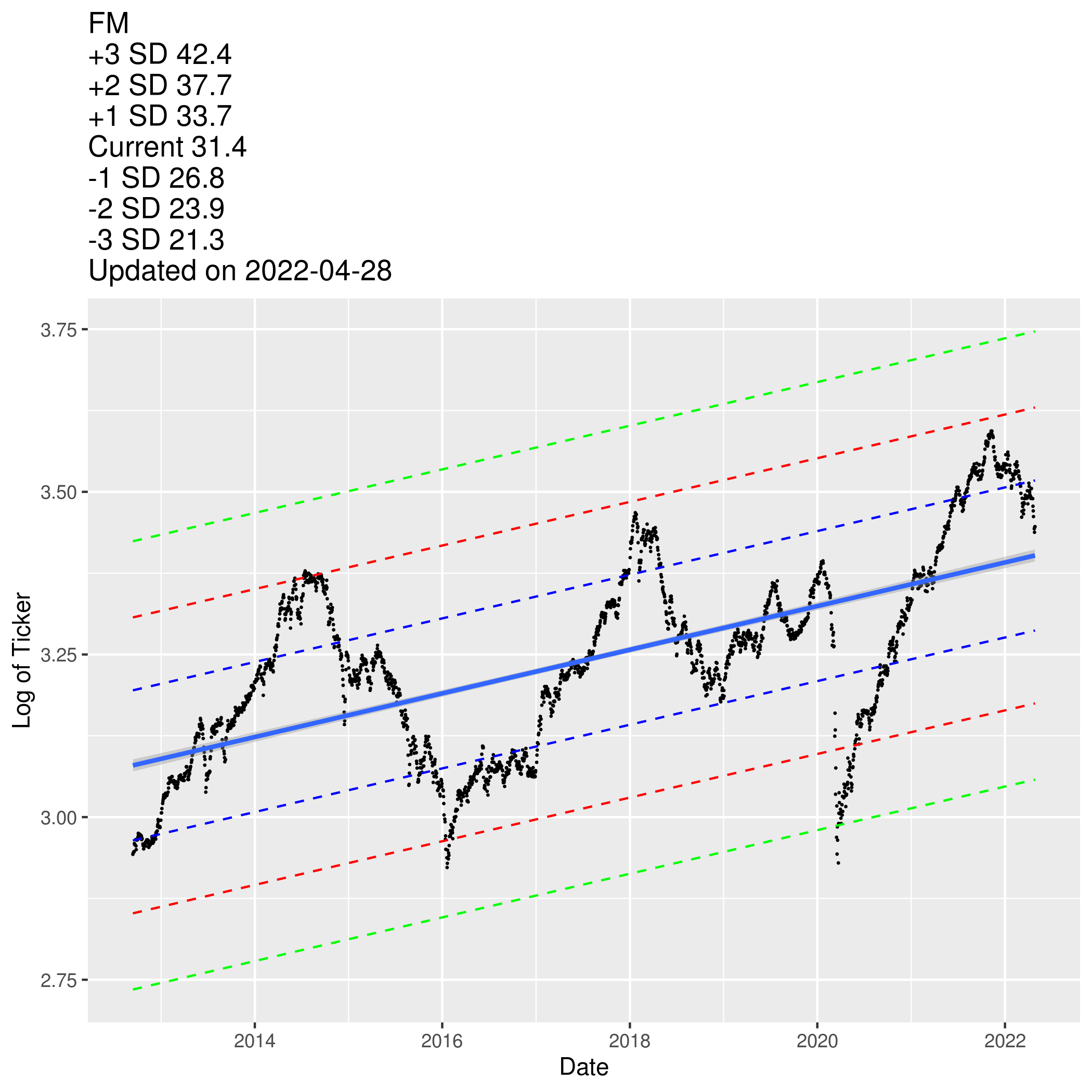
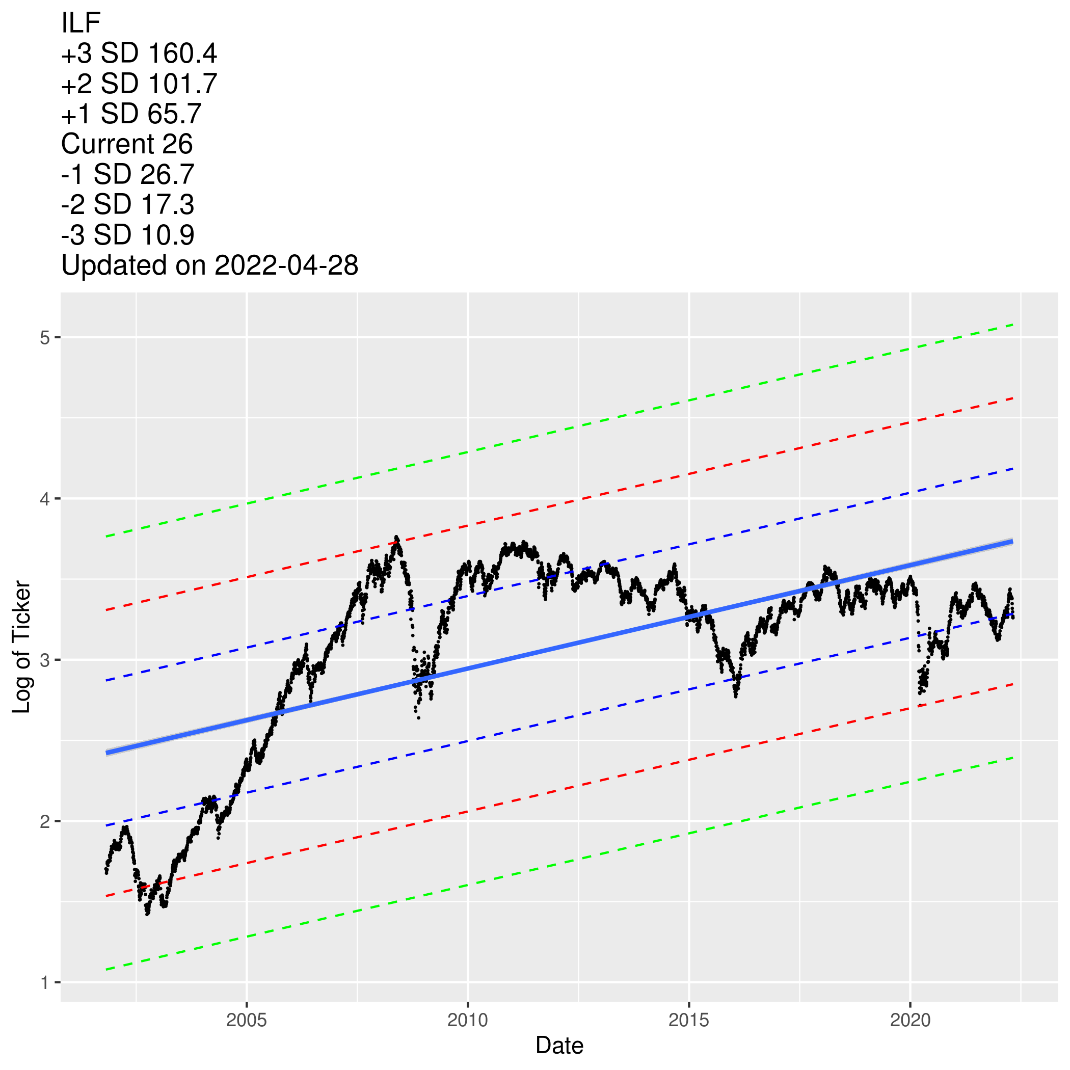
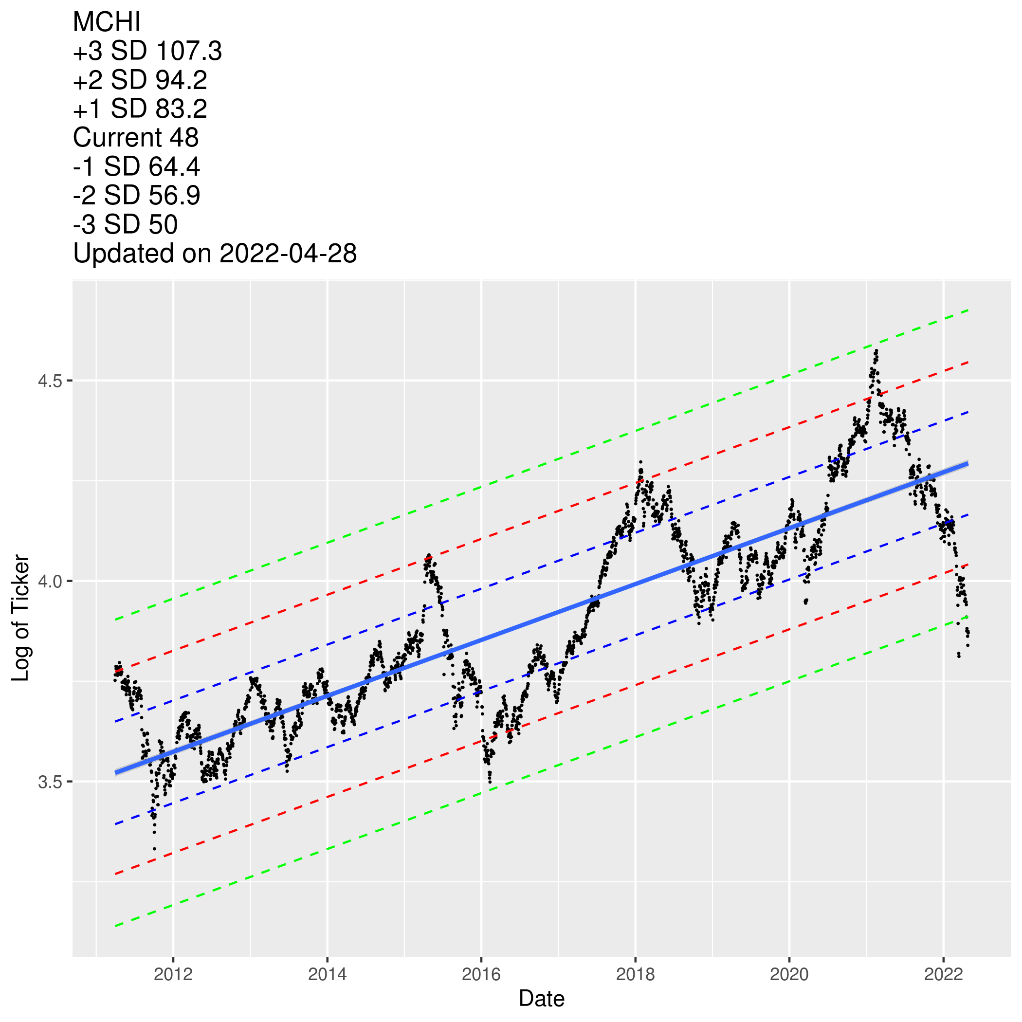
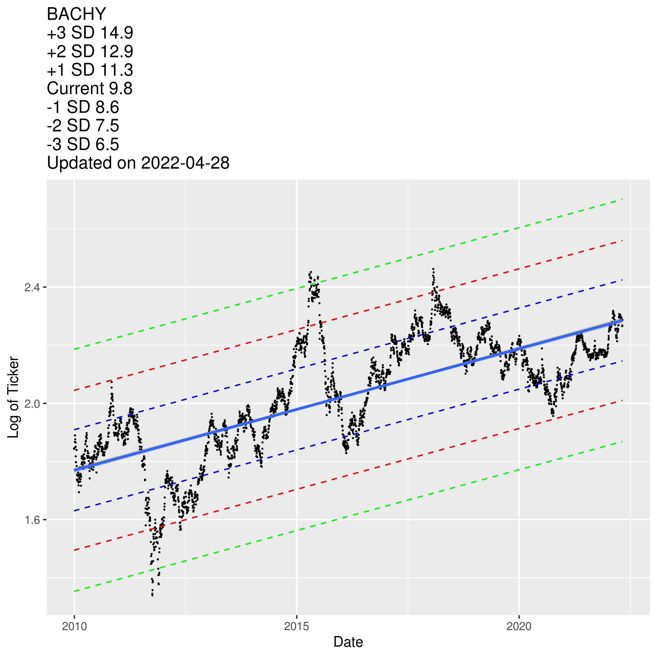
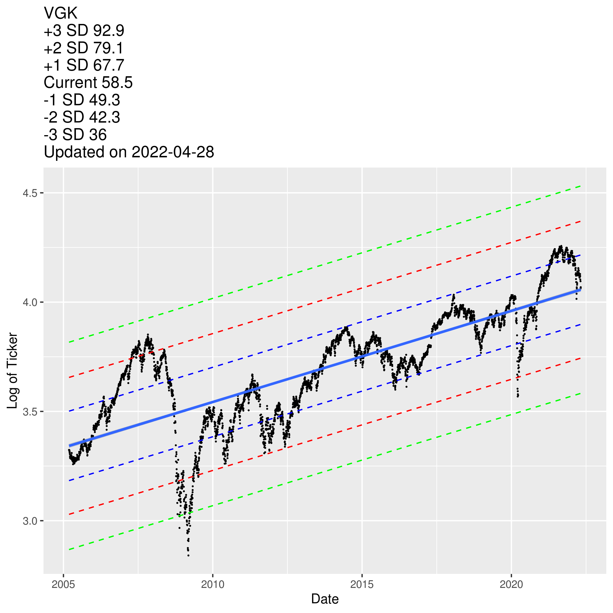
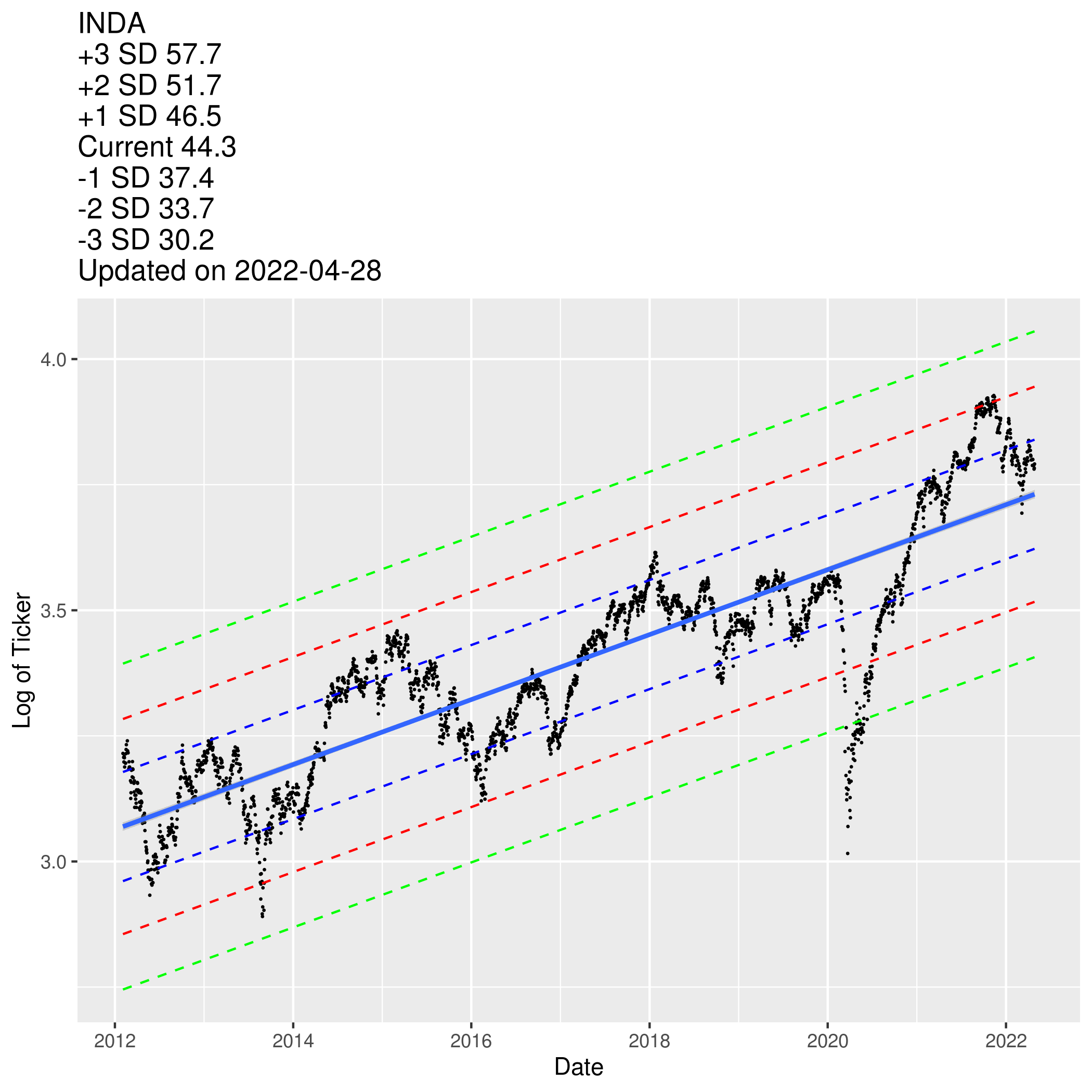
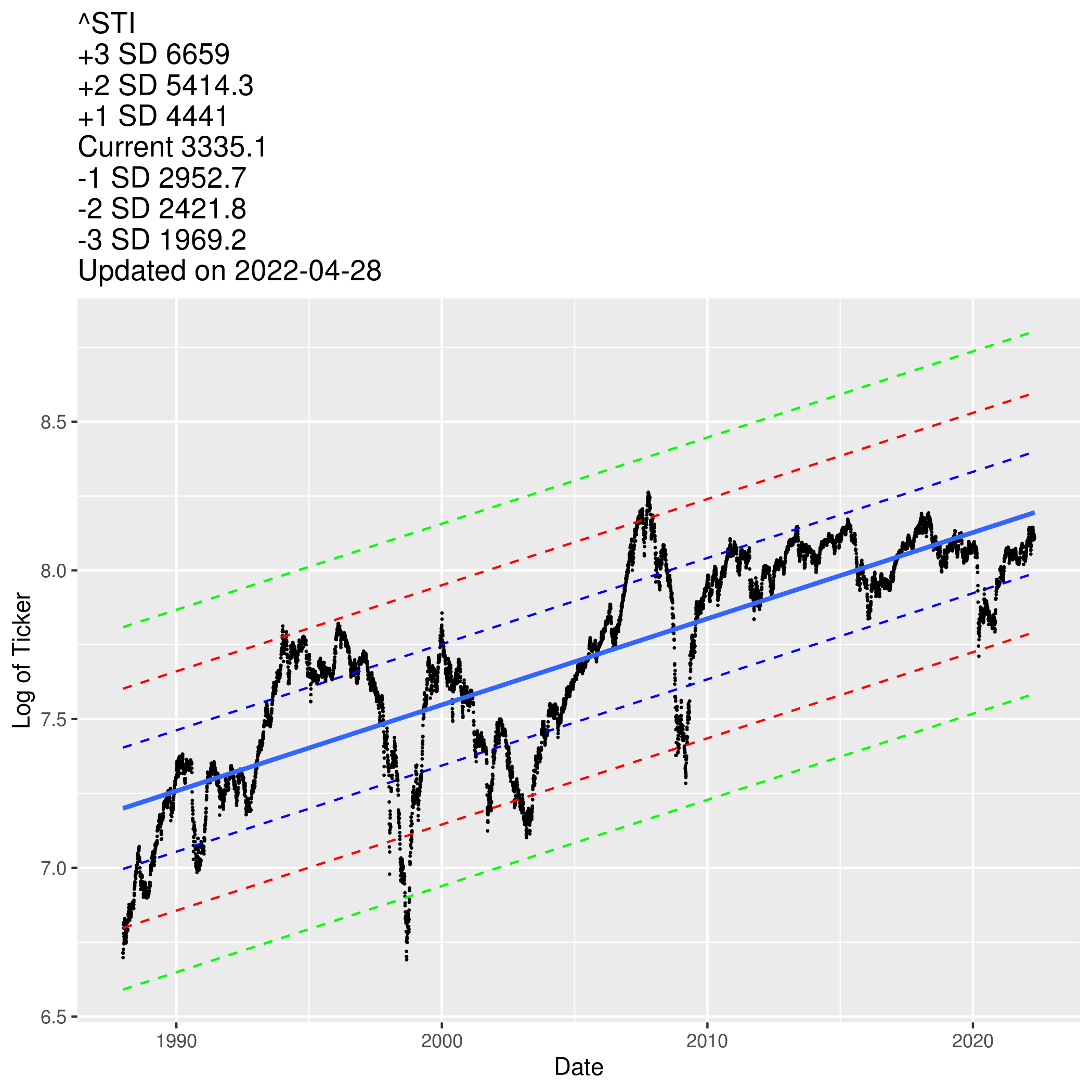
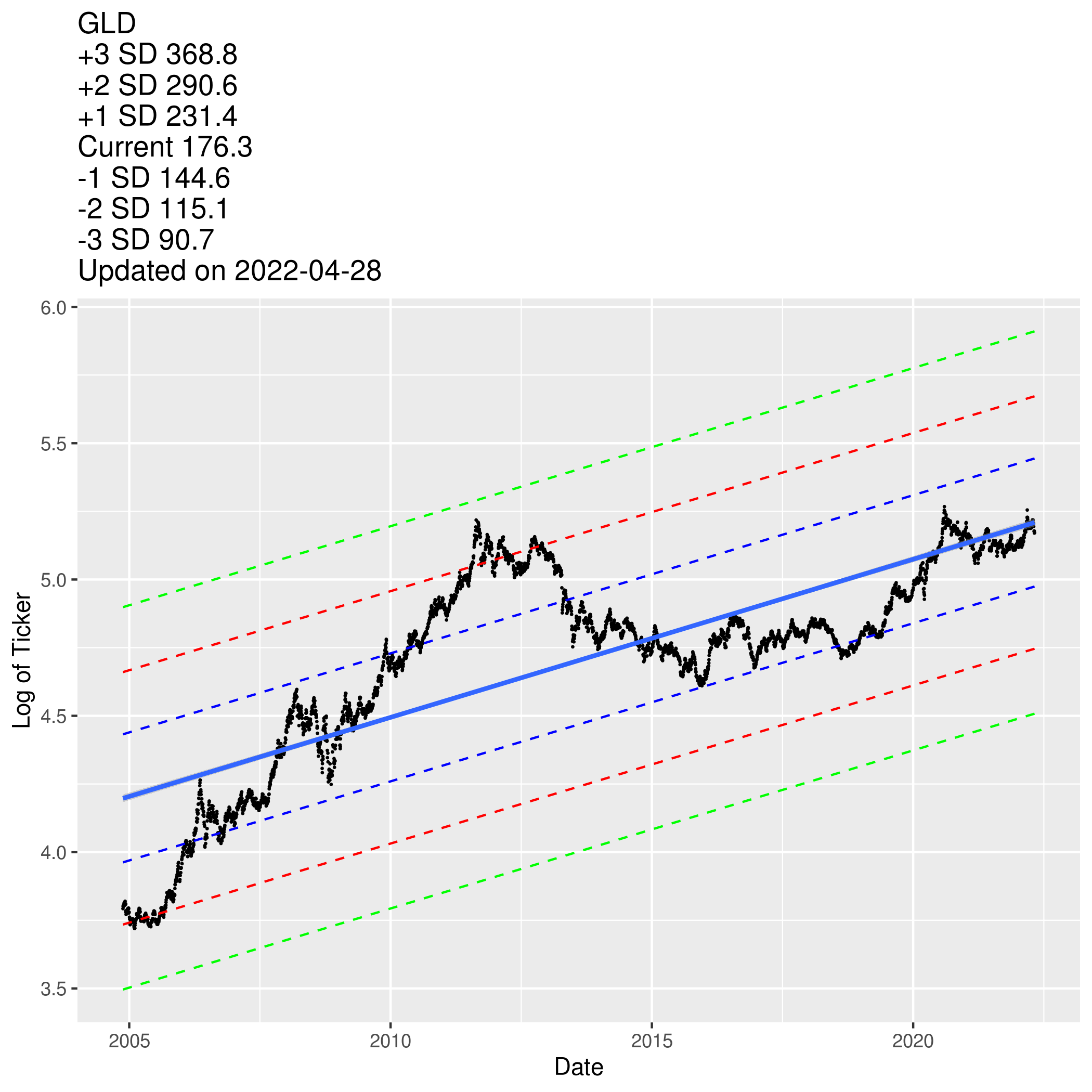
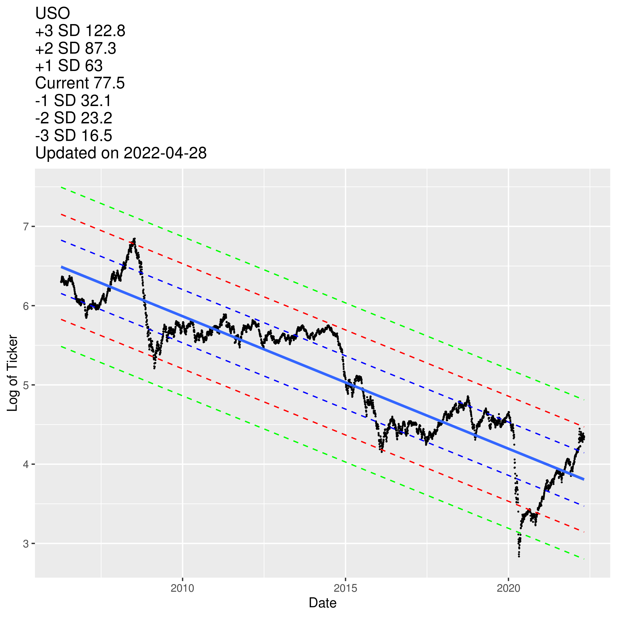
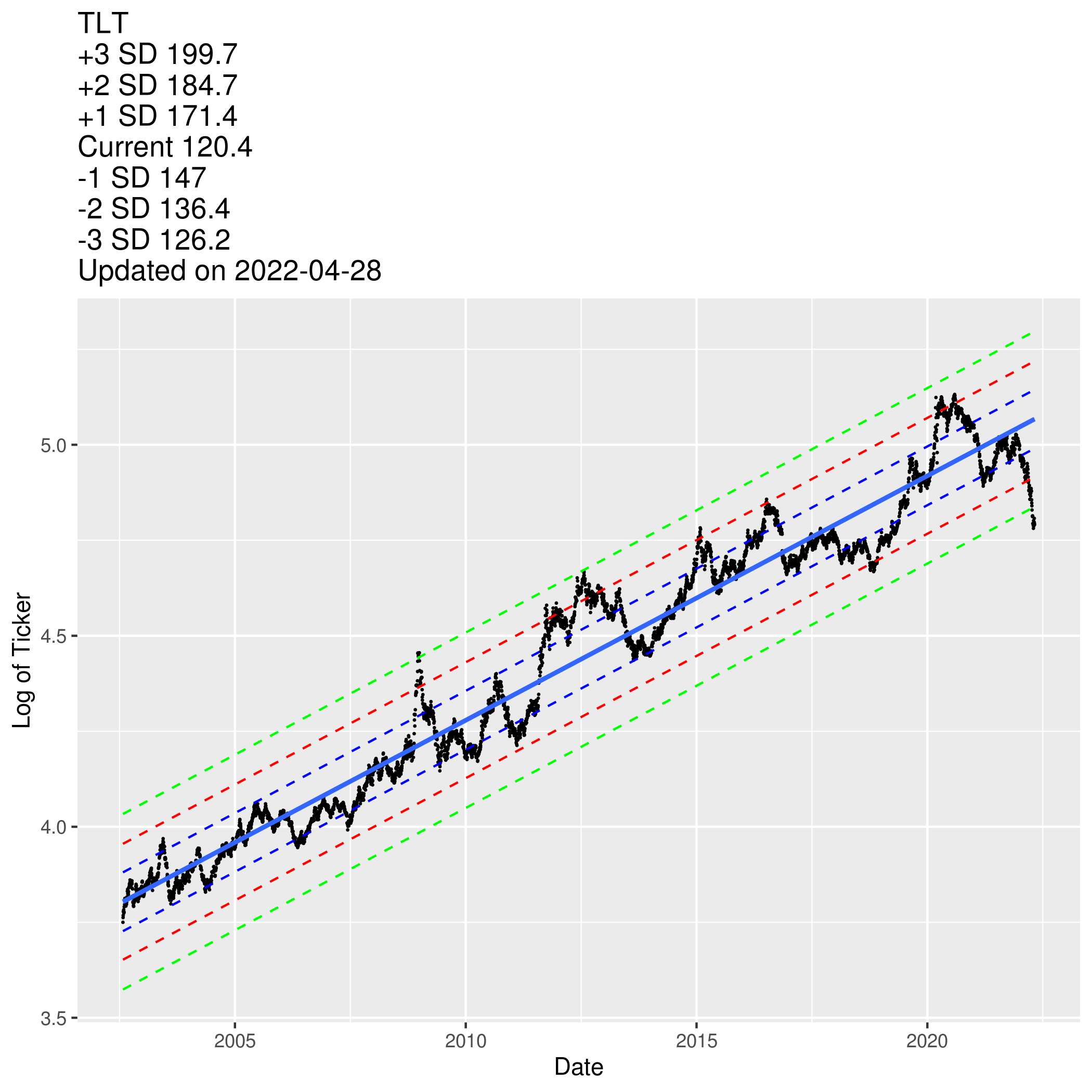
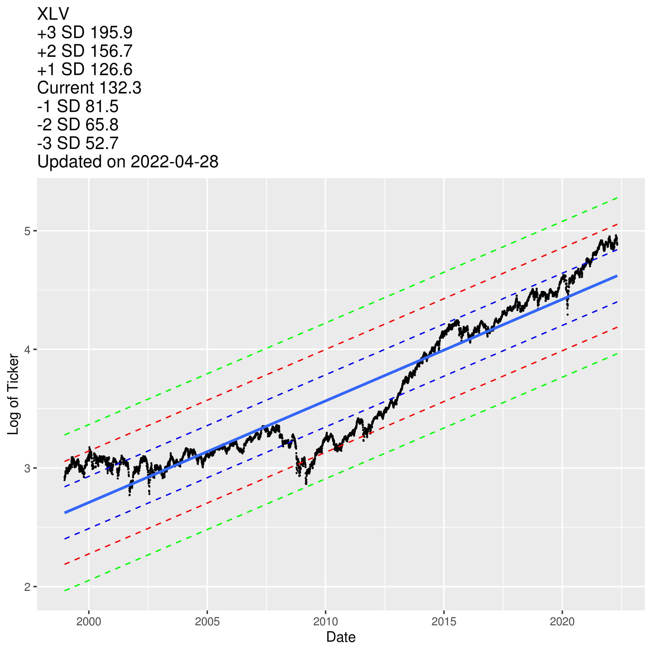
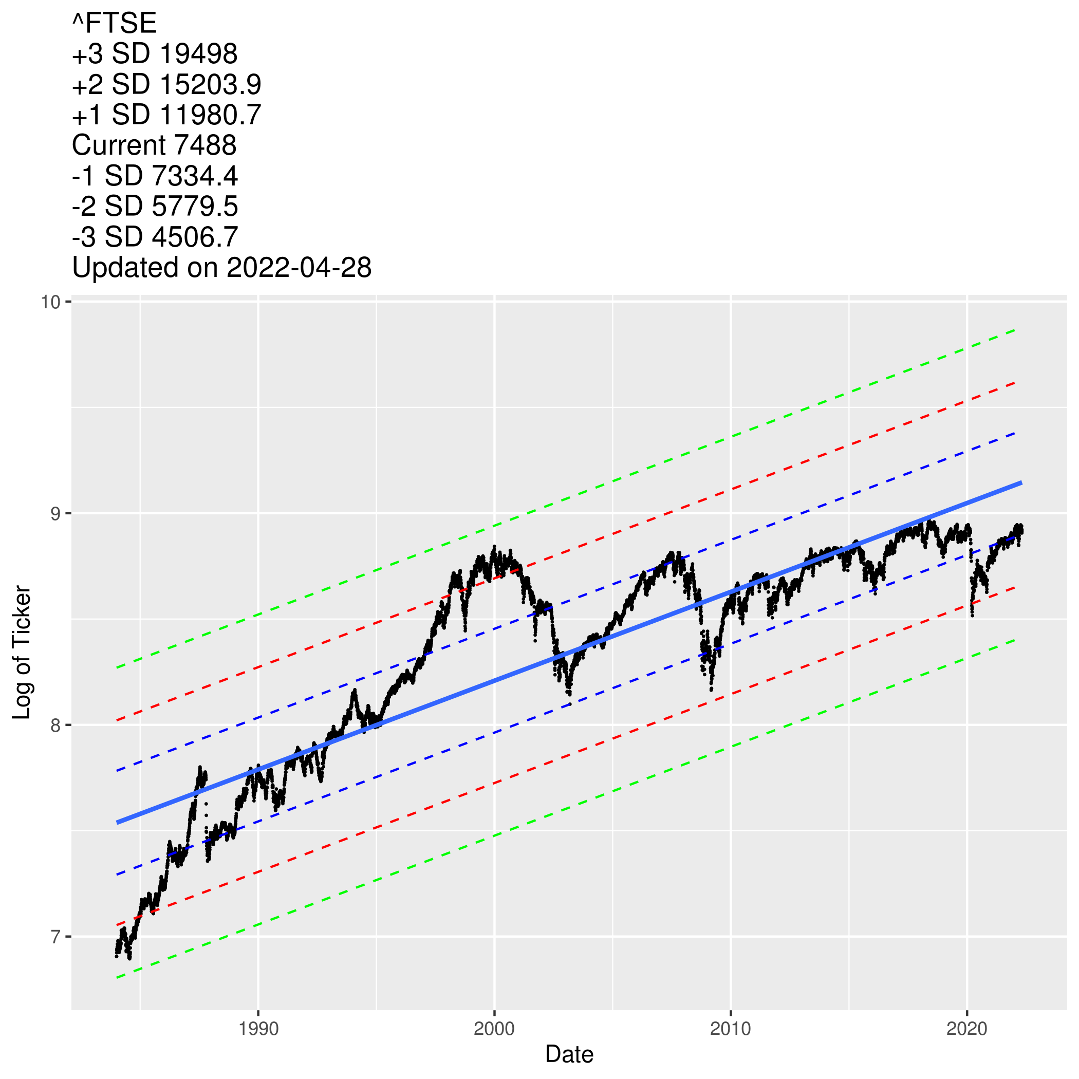
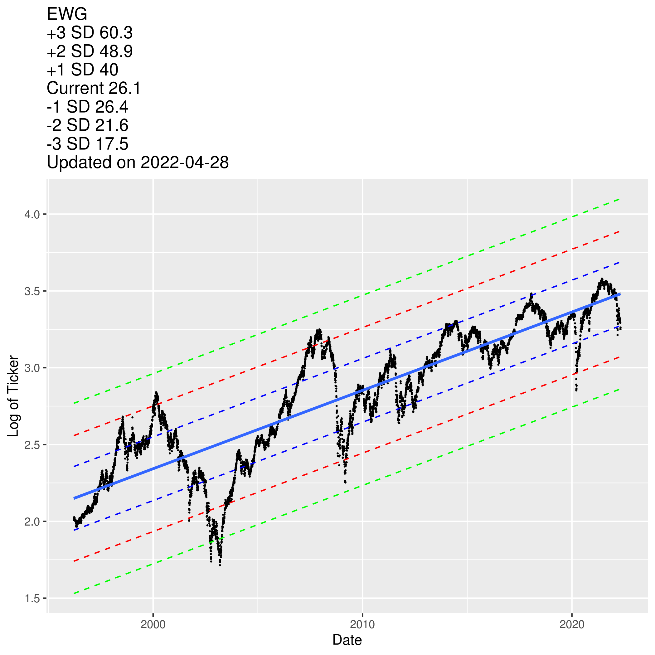
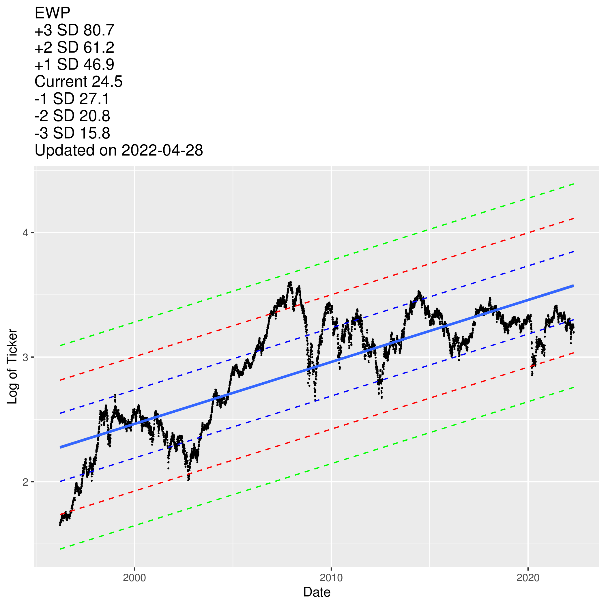
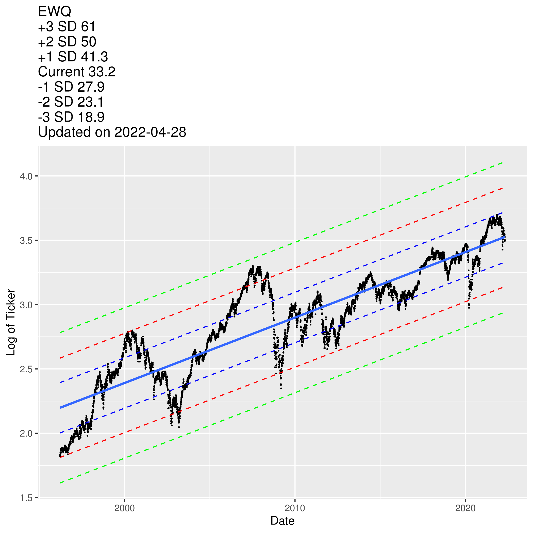
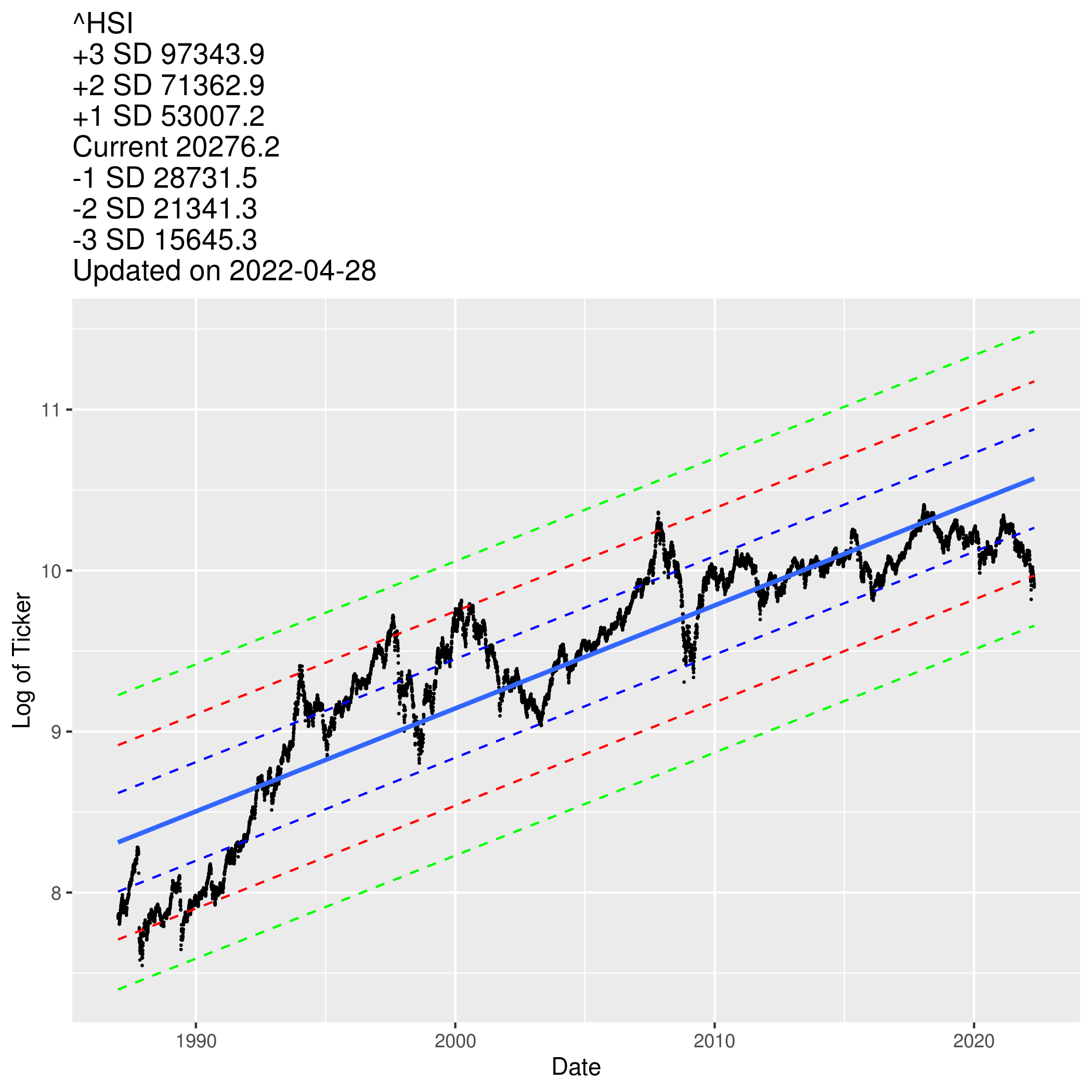
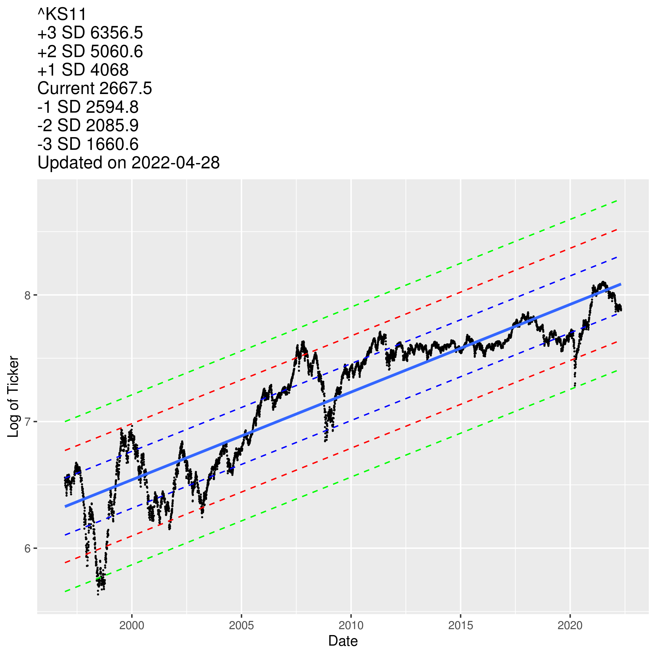
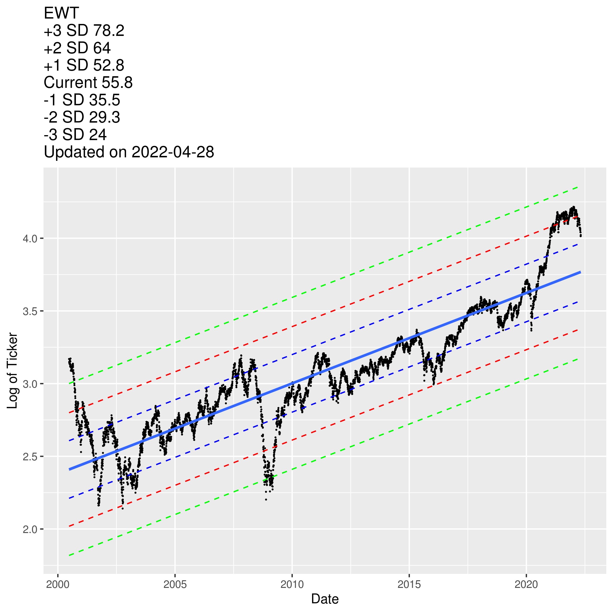
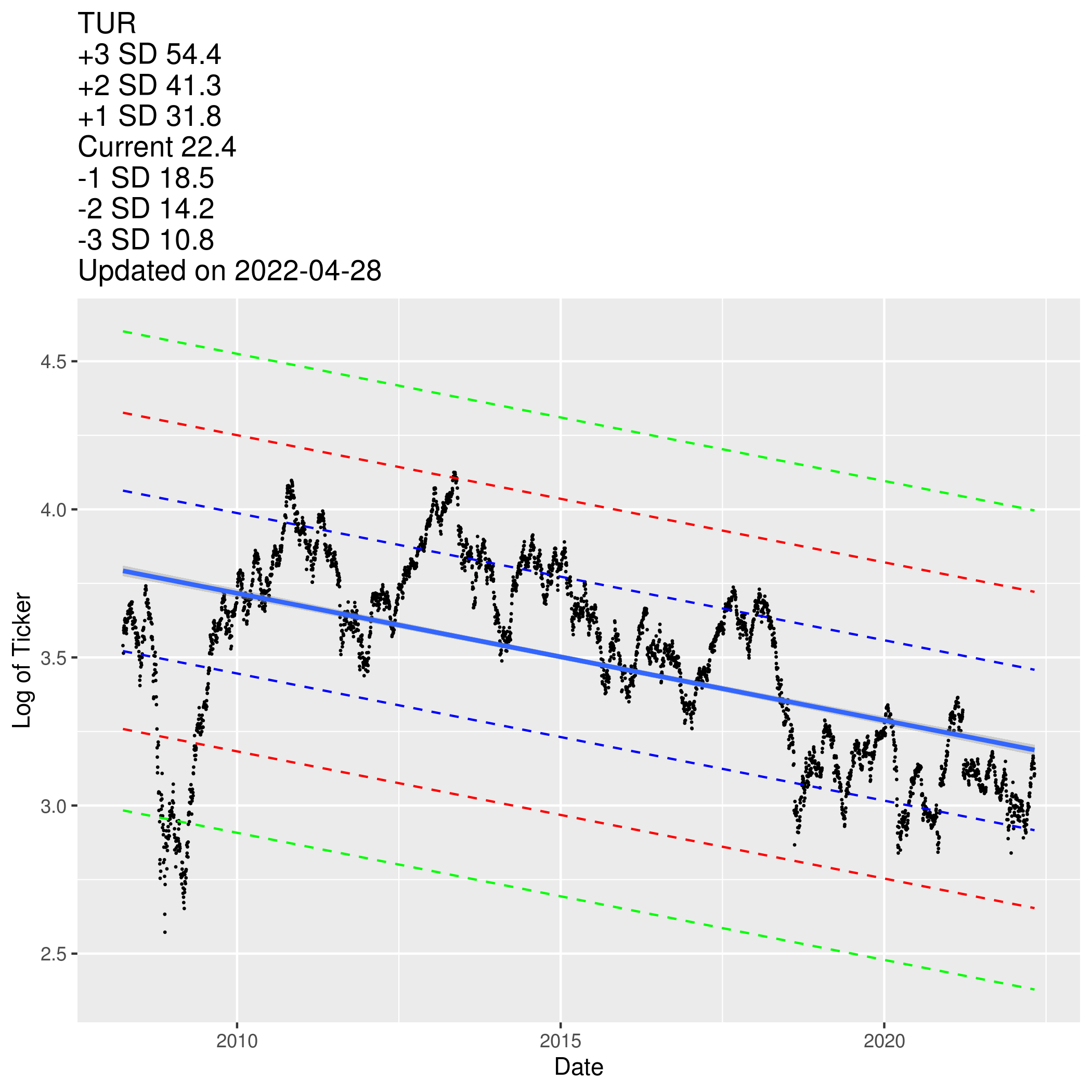
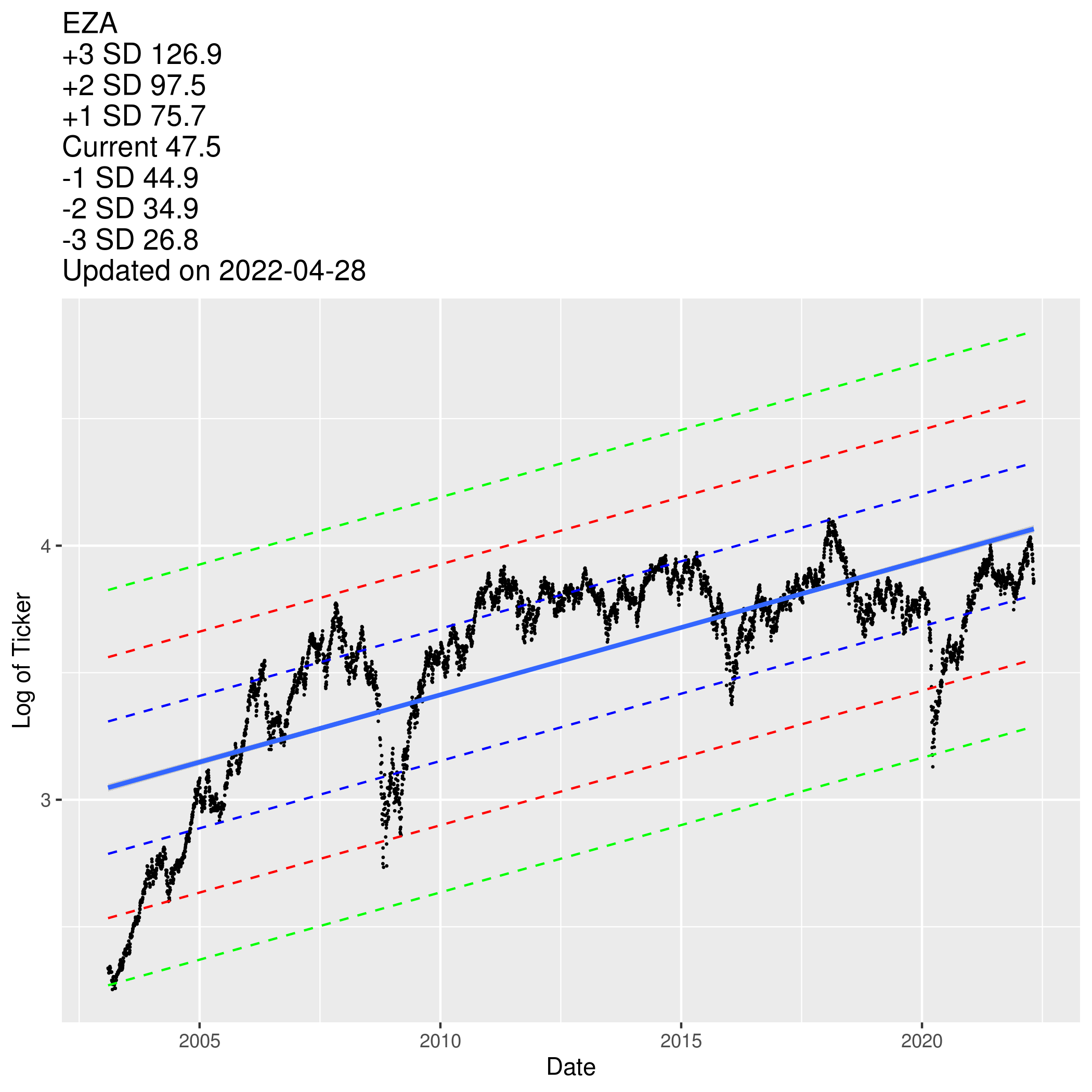
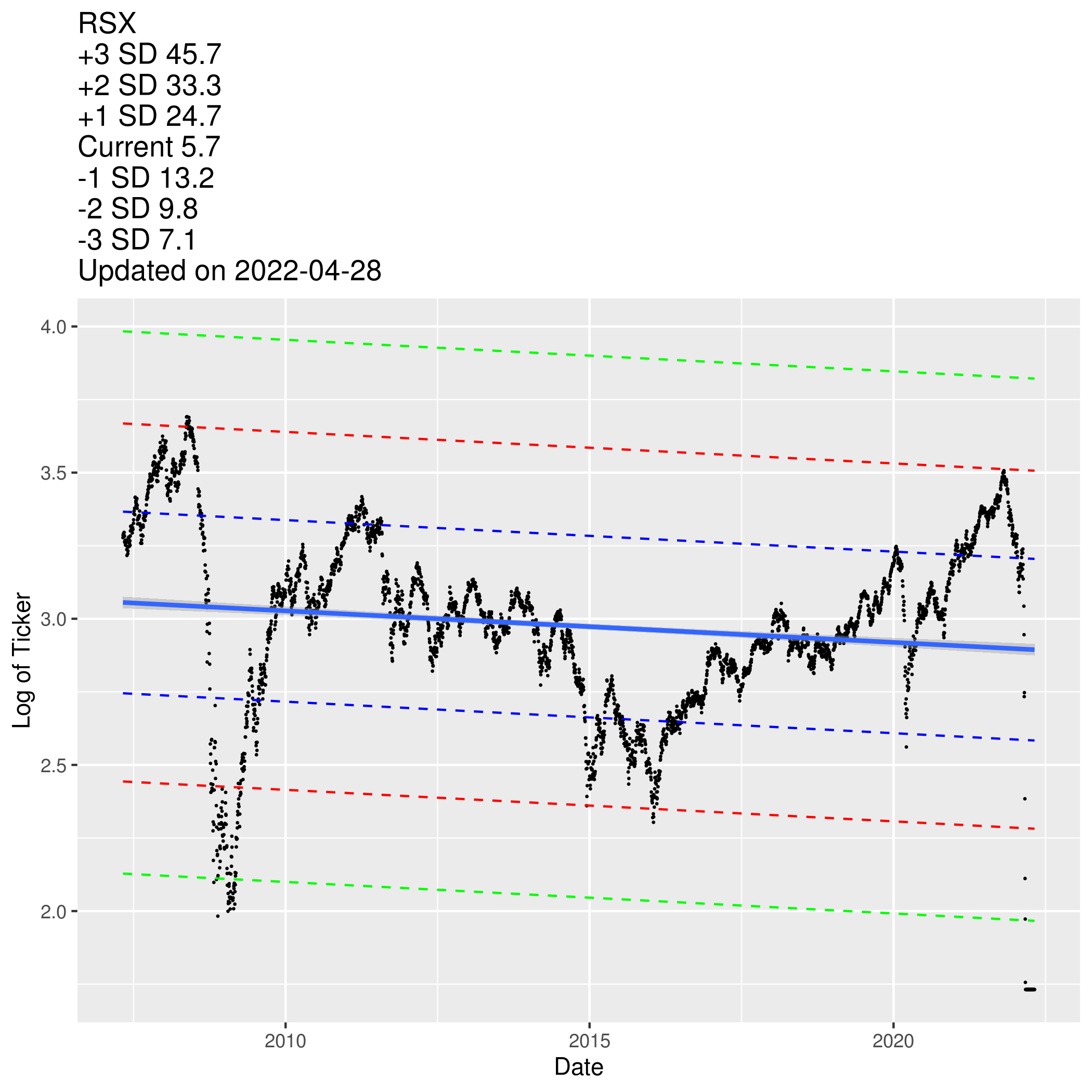
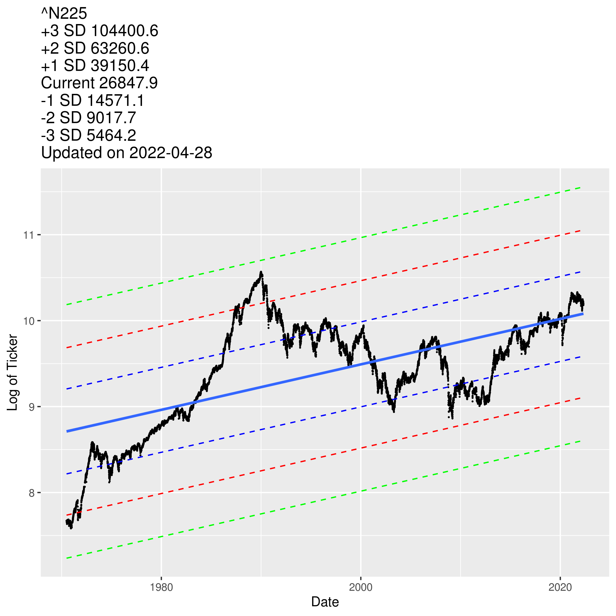
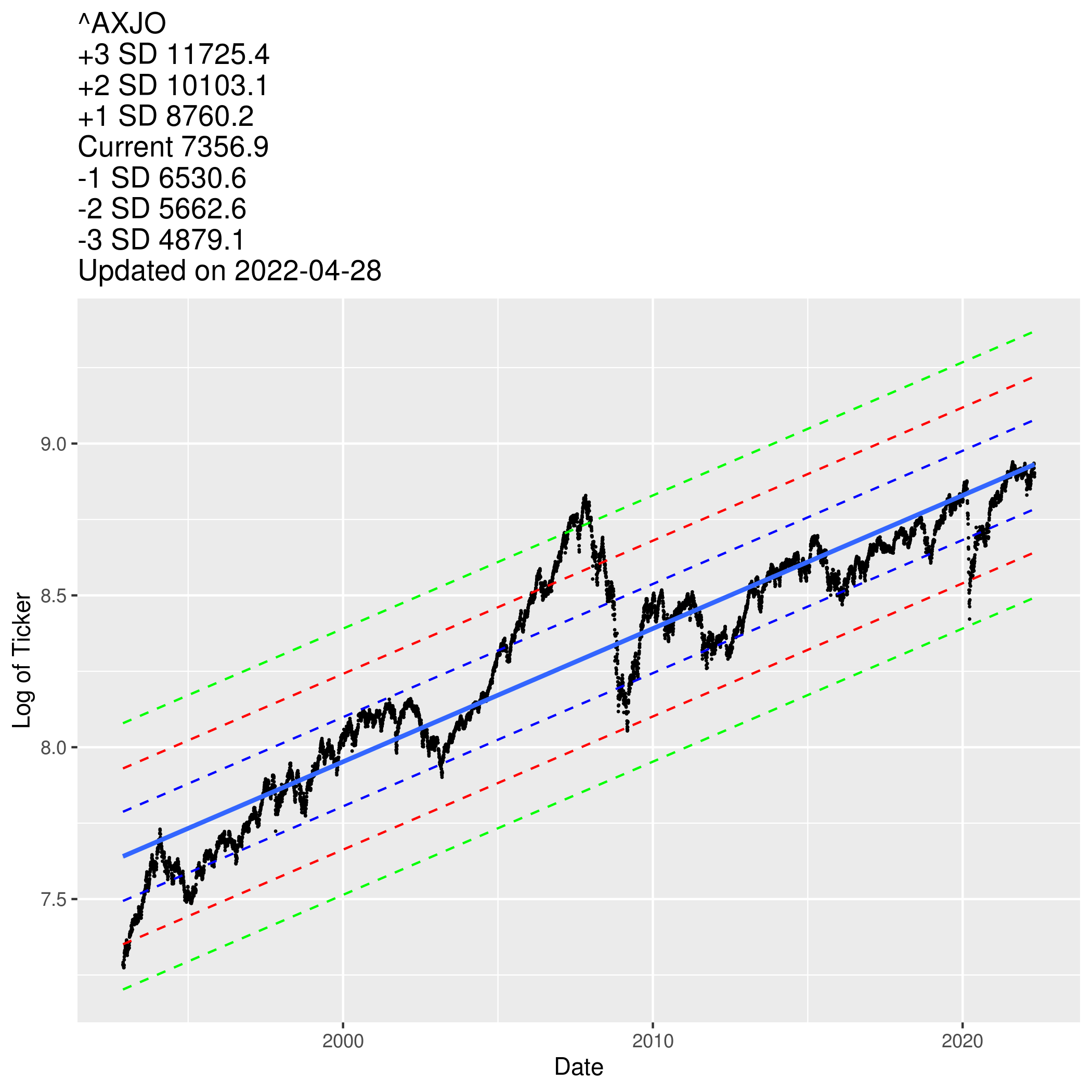
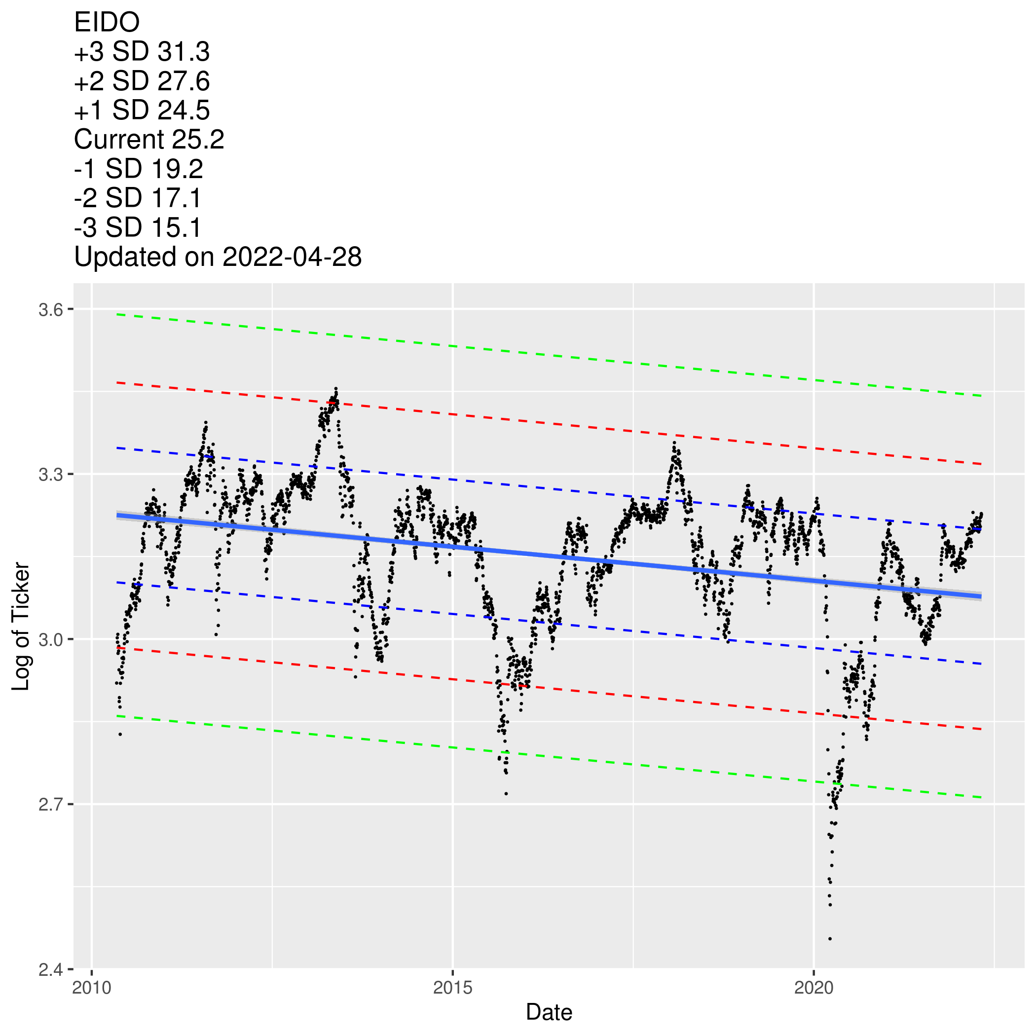
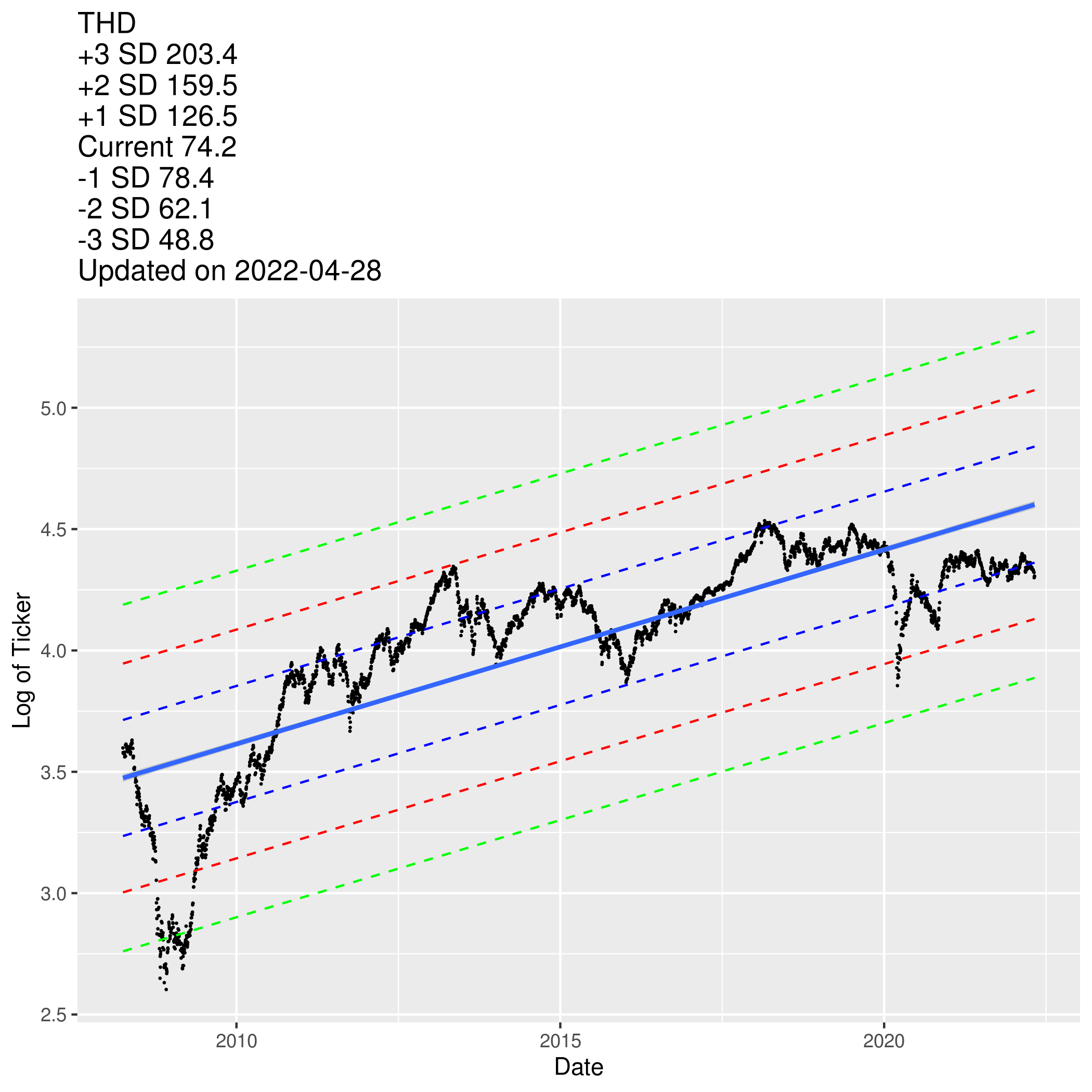
Here’re some quick explanations on the diagrams,
- The highest red dotted line is +2SD which suggest that market is really overheated.
- The second highest blue dotted line is +1SD which suggest that market is moderately overheated.
- Blue line is best fit line. Market is currently at an average trajectory.
- The second lowest blue dotted line is -1SD which suggest that market is moderately undervalued.
- The lowest red dotted line is -2SD which suggest that market is really undervalued.
These diagrams below will aid me in understanding if I should deploy more cash or I might even consider leveraging using interactive brokers margin loan (https://www.interactivebrokers.com/en/index.php?f=1595) when prices are < -2SD.
Without further ado, you may find the diagrams below for your reference pls.
Note:
- I will schedule a cron job to update the diagrams at midnight every day.
- You may find the code after all the diagrams.
World
US SnP 500
Technology (VGT)
Technology (IYW)
Emerging Markets
Frontier markets
Latin America
China
Bank of China
Europe
India
Singapore
Gold
Oil (USO)
TLT (Long Term Bonds)
Healthcare (XLV)
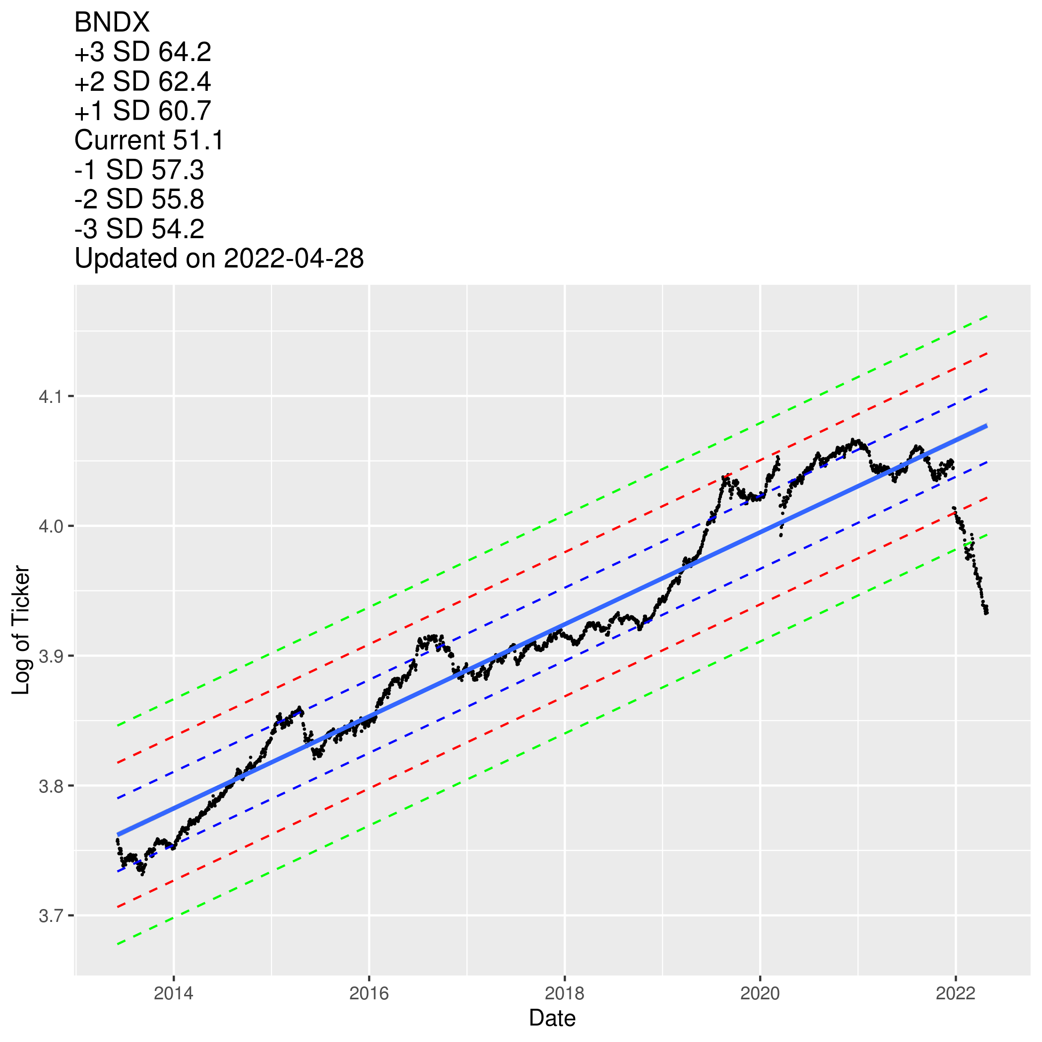
BNDX (Vanguard Total International Bond ETF)
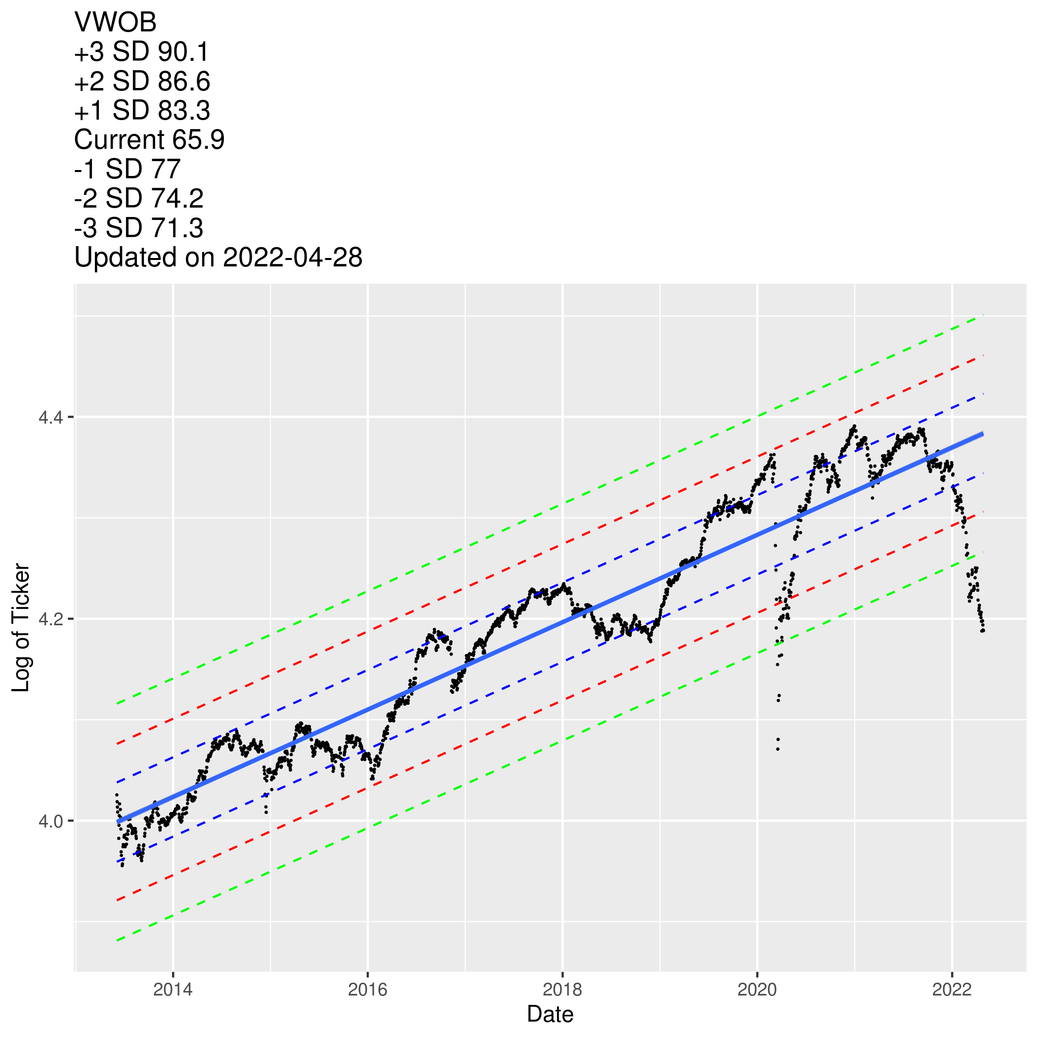
VWOB (Vanguard Emerging Markets Government Bond ETF)
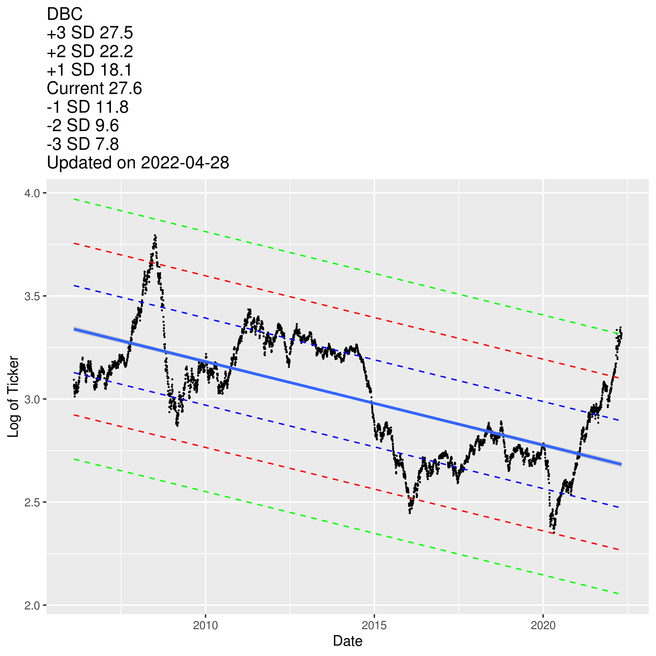
DBC (Commodities)
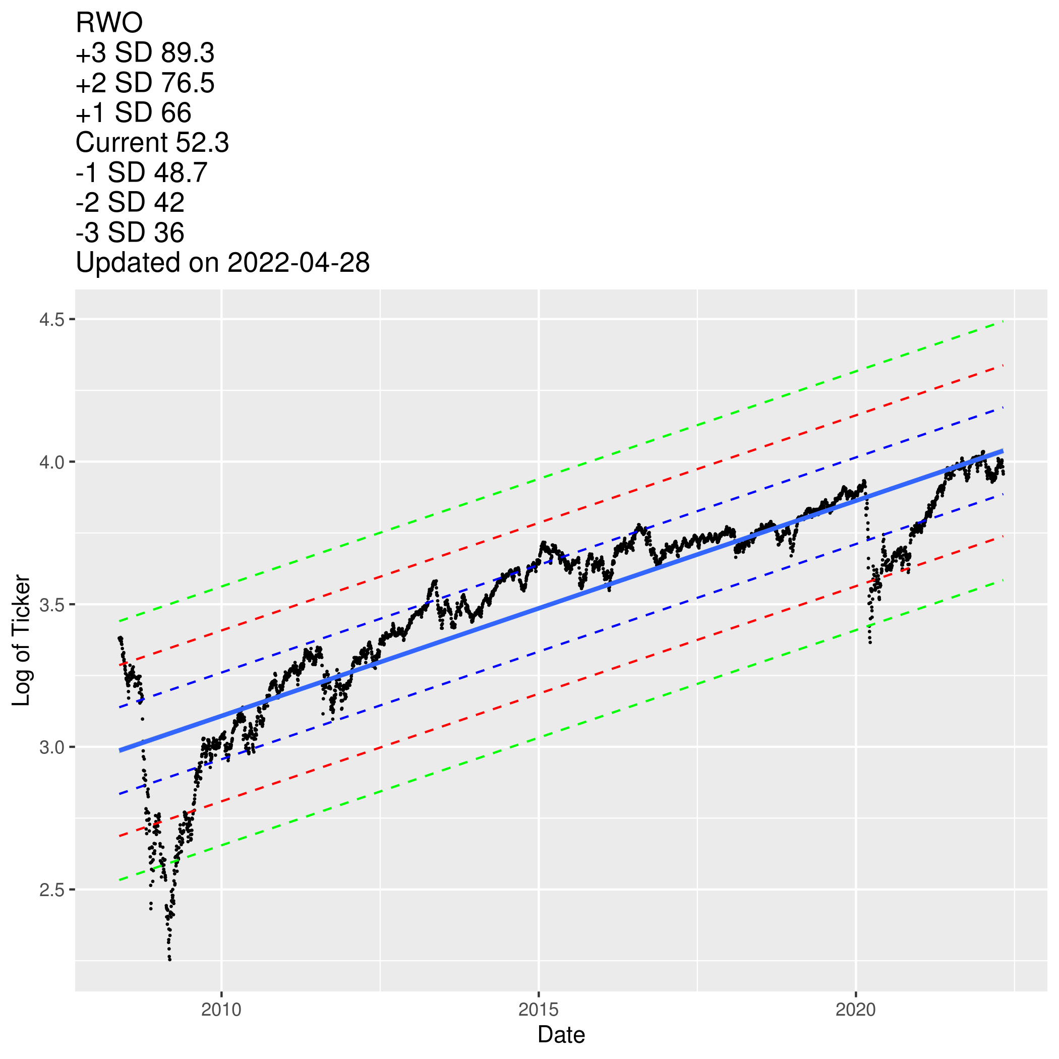
RWO (Global Real Estate)
UK FTSE (included here because of low interest in margin loan)
Germany
Spain
France
HK HSI
Korea
Taiwan
Turkey
South Africa
Russia
Japan Nikkei
Australia (included here because of low interest in margin loan)
Switzerland (included here because of low interest in margin loan)
Brazil
Argentina
Malaysia
Indonesia
Thailand
Code used to produce the diagrams
sapply(c("ggplot2", "plotly"), require, character.only = T)

source('util/extract_stock_prices.R')

#define list of indices
indices = c("VT", "GXC", "^STI", "^GSPC", "VWO", "^FTSE", "^N225", "^HSI", "000001.SS", "^JKSE", "^KLSE", "^KS11")

for(i in 1:length(indices)){

stock = indices[i]
start_date = "1950-07-01"
end_date = "2030-12-30"

data = df_crawl_time_series(stock, start_date, end_date)
data = subset(data, !is.na(data$Adj.Close))
data$Adj.Close = log(data$Adj.Close)
data$Date = as.Date(data$Date)

model1 <- lm(data$Adj.Close ~ data$Date)

temp_var <- predict(model1, interval = "prediction")
temp_var1 <- predict(model1, interval = "prediction", level = 0.68)
temp_var1 = data.frame(temp_var1); names(temp_var1) = c("fit1", "lwr1", "upr1")

new_df <- cbind(data, temp_var, temp_var1)

p = ggplot(new_df, aes(x = Date, y = Adj.Close))+
  geom_point(size = 0.1) +
  geom_line(aes(y=lwr), color = "red", linetype = "dashed")+
  geom_line(aes(y=upr), color = "red", linetype = "dashed")+
  geom_line(aes(y=lwr1), color = "blue", linetype = "dashed")+
  geom_line(aes(y=upr1), color = "blue", linetype = "dashed")+
  geom_smooth(method=lm, se=TRUE) +
  ylab("Log of Ticker") +
  ggtitle(paste(stock,
                "\n+2 SD", round(exp(new_df$upr[nrow(new_df)]), 0),
                "\n+1 SD", round(exp(new_df$upr1[nrow(new_df)]), 0),
                "\nCurrent", round(exp(new_df$Adj.Close[nrow(new_df)]), 0),
                "\n-1 SD", round(exp(new_df$lwr1[nrow(new_df)]), 0),
                "\n-2 SD", round(exp(new_df$lwr[nrow(new_df)]), 0),
                "\nUpdated on", Sys.Date()
                )
         )
p

p

ggsave(filename = paste0(stock, ".png") , plot = p)

}